



src/styles/tokens/type.css:43
Why does Arabic text look smaller than English at the same font-size?
font-size does not set the size of anything a reader can see. It sets the em box, and how much of that box the ink fills is the type designer's decision — which is why two faces at the same declared size can differ by a tenth of their apparent height with nothing wrong anywhere. Between a Latin sans and an Arabic sans that gap is the normal case rather than the exception.
This site sets body copy at 17px on a wide desktop, and the Arabic documents take 0.9 of that through a per-locale multiplier, so 15.3px. At that size the face this site used to ship, Cairo, drew its tooth — the short vertical that begins beh, and the height Arabic prose is read at — to 7.650px of ink. Zain, dropped in unadjusted, draws the same feature to 6.847px. No CSS changed; the paragraph simply lost a tenth of the ink a reader judges its size by.
The lever CSS offers is the size-adjust descriptor on @font-face: a multiplier applied to the whole face, outlines and metrics together, so two fonts can be made to agree at one declared font-size. MDN records it as Baseline widely available since September 2023, and caniuse puts it at 93.58 per cent of users. What neither of them gives you is the number to put in it.
- 7.650 px Cairo tooth ink the height being matched, at 15.3px
- 6.847 px Zain tooth, unadjusted 10.5 per cent less ink than Cairo
- 7.668 px Zain tooth at 112 per cent 0.24 per cent over the target
- 8.263 px Quicksand x-height ink the Latin column, at 17px
Every one of those four figures is arithmetic over a glyph bounding box and a token value rather than a screenshot, and that is the point of the method: it runs before the font ships, and it runs again the day the typeface changes.
The same outlines set the line-height those paragraphs sit on, and that number is measured rather than chosen — computing the real floor.
fontTools 4.60.2 · five faces
What replaces x-height when the script has no x?
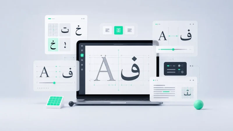
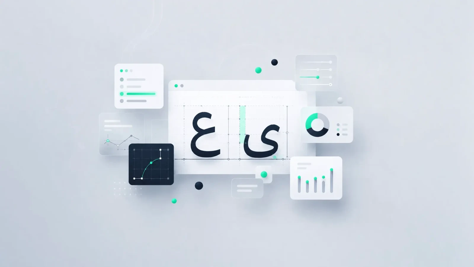
Arabic has no x and no capitals, and the standard reference is blunt about borrowing the words anyway: do not use x-height and cap height, Azza Alameddine writes, simply because there are no x or capitals in Arabic. What Arabic has instead is a tooth, the short vertical that begins beh and teh; a loop, the bowl of heh and waw; an eye, the head of ain; and the alef, a plain vertical that sets the ascender line.
Measuring those features across the five Arabic cuts this site has shipped turned up something the stylesheet does not record. In Cairo the tooth, the loop, the eye and the Latin lowercase x are all drawn to exactly the same line — 0.5000em in Regular and 0.5010em in SemiBold, to the design unit. The designer of a dual-script family had already written the equation into the outlines. CSS has no property that can read it back out.
from fontTools.ttLib import TTFont
from fontTools.pens.boundsPen import BoundsPen

f    = TTFont('zain/regular.woff2')
upm  = f['head'].unitsPerEm       # 800 for Zain, 1000 for Cairo
gs   = f.getGlyphSet()
name = f.getBestCmap()[0x0628]    # beh — the tooth

pen = BoundsPen(gs)
gs[name].draw(pen)
print(pen.bounds[3] / upm)        # 0.4475

# and what not to trust, in this font:
print(f['OS/2'].sxHeight   / upm) # 0.600 — drawn x tops at 0.460
print(f['OS/2'].sCapHeight / upm) # 0.874 — drawn H tops at 0.695
| Face | tooth ب | loop و | Latin x |
|---|---|---|---|
| Cairo Regular | 0.5000 | 0.5000 | 0.5000 |
| Cairo SemiBold | 0.5010 | 0.5010 | 0.5010 |
| Noto Kufi Bold | 0.4950 | 0.4950 | 0.5460 |
| Zain Regular | 0.4475 | 0.4713 | 0.4600 |
| Zain Bold | 0.4575 | 0.4800 | 0.4700 |
Noto Kufi is the counter-example. Its tooth sits at 0.4950 and its Latin x at 0.5460, 10.3 per cent apart, so an Arabic word and a Latin one beside it were never on the same mean line. Zain lands between the two: its Latin x is 2.8 per cent above its tooth, which is close to the harmony between the Latin and the Arabic its README claims, and not the same thing as Cairo's exact match.
src/styles/locale/arabic.css:41-56
Why does one Arabic design need two size-adjust values?
Cairo and Noto Kufi were two designs, so a display heading and the paragraph under it could differ by face. Zain is one design, and collapsing two families into one leaves weight and metrics as the only levers — which is where the tooth-to-alef ratio stops being trivia and becomes the constraint.
That ratio is a property of the design rather than of the script. Cairo moves only from 0.697 to 0.702 between its two cuts, seven parts in a thousand, so inside Cairo a single multiplier would have served both roles. Zain's is 0.644 and 0.658. Substituting a design whose ratio differs is what forces two values, and no amount of care in the CSS can collapse them back into one.
| Face | tooth ب | alef ا | tooth to alef |
|---|---|---|---|
| Cairo Regular | 50.000% | 71.700% | 0.697 |
| Cairo SemiBold | 50.100% | 71.400% | 0.702 |
| Zain Regular | 44.750% | 69.500% | 0.644 |
| Zain Bold | 45.750% | 69.500% | 0.658 |
| Noto Kufi Bold | 49.500% | 76.000% | 0.651 |
Prose is read at tooth height, the way Latin prose is read at x-height, so the prose family matches Zain's tooth to Cairo's: 0.500 divided by 0.4475 is 1.117, and the declaration says 112 per cent. Display is read at alef height — every impact word on this site is one word of verticals — so the display family matches Zain's alef to Cairo SemiBold's: 0.714 divided by 0.695 is 1.027, and the declaration says 103 per cent.
Those two answers are 8.76 per cent apart, and the spread is the whole argument. Use 112 per cent for display as well and an Arabic impact word renders 9.02 per cent taller than the Cairo alef it is matched to. Use 103 per cent for prose as well and the tooth comes out 7.82 per cent short. Picking one value is not a simplification; it is choosing which of the two roles to be wrong about.
There is also a competing convention about which metric to match at all. Edo Smitshuijzen, writing on dual-script proportions, matches the Latin x-height to the loop height rather than the tooth and asks the designer to narrow the gap between the two. In Cairo the argument is moot, because tooth, loop and Latin x are the same 0.500em. In Zain the two rules diverge: the tooth gives 112 per cent and the waw loop gives 106. This site took the tooth branch because the face it was reproducing had already equated all three.
Replacing two Arabic families with one also changed what happens to the Latin runs inside an Arabic page — the unicode-range that stops a font capturing Latin.
OS/2 sxHeight 480 · upm 800
Why not use font-size-adjust, the property built for this?
CSS ships a property for exactly this problem. font-size-adjust normalises one font against another by the ratio of a named metric, and the mainstream advice on how to pick its value is to set a lowercase x in two fonts and nudge until they match. That advice is entirely Latin, and the property cannot do this job for three independent reasons — any one of which would be enough on its own.
Start with the one that is easiest to see. The choice of metric is the choice of answer, and the property offers no way to ask for the row an Arabic face needs.
- No Arabic metric exists
- The default metric is ex-height, and CSS Values defines the ex unit as the used x-height of the first available font, so called because it is often equal to the height of the lowercase x. The two-value form adds cap-height, ch-width, ic-width and ic-height. All five are defined on a Latin or a CJK reference glyph, and there is no Arabic option among them.
- The field is wrong in the shipped font
- Zain records OS/2 sxHeight 480 and sCapHeight 699 in an 800-unit em — 0.600em and 0.874em — where its drawn x tops at 0.460em and its drawn H at 0.695em, 30.4 and 25.7 per cent out. Reading from-font on this face would return 0.600: not the tooth, not the loop, not even that face's own Latin x-height. The figures look like values authored in a 1000-unit em and never rescaled, but that is a hypothesis about the cause; only the discrepancy is measured.
- The two do not compose
- CSS Fonts 5 states that font-size-adjust is applied after the size-adjust descriptor, with the consequence that size-adjust appears to have no effect. They are alternatives, not a progressive-enhancement pair, and a stylesheet that sets both has silently thrown one away.
Support is the least of the three problems, and the two places you would look it up disagree. caniuse gives font-size-adjust 88.02 per cent global with full support from Chrome and Edge 127; MDN splits the syntaxes and puts the metric-keyword form at Chrome and Edge 129, Firefox 129 and Safari 18, recording the property as Baseline 2024. Both were read on 26 August 2026. The descriptor, by contrast, has been widely available for three years.
So the property designed for cross-font size matching depends on a field defined against a letter Arabic does not have, and in the font this site actually ships that field is out by nearly a third. The blunt per-face multiplier is the only tool on the platform that can carry a measurement CSS has no vocabulary for.
hhea 1303/-571 against 869/-459
Why the Arabic faces carry no ascent-override
The Latin side of this site declares a size-adjust, an ascent-override and a descent-override on every face — three synthetic families over four physical files, and two of those families point at the same .woff2 while declaring different metrics. The Arabic sheet declares only the size-adjust. That is the one place the two files disagree on purpose.
The Latin overrides exist so that a Quicksand swap does not reflow against Arial. Arabic cannot buy the same thing, because neither Quicksand nor Arial carries any Arabic at all: the real fallback is whatever naskh the platform happens to supply, and there is nothing stable to pin to. Then the arithmetic says the overrides would have bought almost nothing anyway.
- 1.87400 Cairo content box, em ascent 1303, descent -571, upm 1000
- 1.85920 Zain at 112 per cent, em 869 and -459 in an 800-unit em
- 0.79% the gap between them what an override would have corrected
What the overrides would otherwise have bought — a line box the existing line-heights were already tuned against — the size-adjust delivers by itself, because it scales the font's own ascent and descent along with the outlines.
The plan this phase started from wrote those overrides as raw ink percentages beside the size-adjust, and it would have been wrong by exactly 12 per cent. The stylesheet records that number and gives the wrong mechanism for it: it says the override would not have been scaled, because the adjustment is applied first and the override replaces the result. CSS Fonts 5 says the opposite — all metrics associated with this font, including overrides provided by @font-face descriptors, are scaled by the given percentage.
The 12 per cent survives the correction, for the mirror-image reason. An ascent-override of 130.3 per cent and a descent-override of 57.1 per cent, which is Cairo's box stated as ink, multiplied by a size-adjust of 112 per cent, give 2.0989em where 1.874em was intended. Two independent routes reach the same figure, so the decision was right either way — but the reason a future reader takes from that file would not be.
GSUB advances · four strings
Does matching the tooth keep the paragraphs wrapping where they did?
The stylesheet says it does, and the handoff document says it twice: every Arabic paragraph keeps the measure, the wrap points and the line count it has today. Re-measuring for this article points the other way, and the claim is not supported by anything recorded in the repository.
Matching a tooth to a tooth is a vertical operation. Set width is a separate quantity that no vertical match controls, and Zain is a wider design than Cairo. Resolving contextual forms through each font's own GSUB initial, medial, final and isolated single substitutions — 91 substitutions on the test paragraph, zero missing glyphs in either font — and summing the advances gives the figures below.
| String | Cairo Regular | Zain at 112% | vs Cairo |
|---|---|---|---|
| stack body paragraph, 143 characters | 63.3040 | 79.0832 | +24.93% |
| journey card 04 title, 38 characters | 16.6920 | 20.8656 | +25.00% |
| projects heading, 13 characters | 5.8590 | 7.3878 | +26.09% |
| code and design heading, 14 characters | 6.0130 | 7.4872 | +24.52% |
The lines get longer, the wrap points move and the paragraphs get taller. The optical decision survives the correction — matching the tooth is still the right way to size Arabic prose against a Latin face — but the consequence claimed for it does not, and a rebuild that budgeted its Arabic layout on unchanged wrap points would have been surprised late.
The measurement has honest limits. The test paragraph contains no lam-alef pairs, which removes the largest ligature confound for that one string; nothing here was rendered by a browser. It is fontTools reading each font's own substitution tables, which is enough to establish the direction and the rough magnitude and not enough to predict where a specific line breaks.
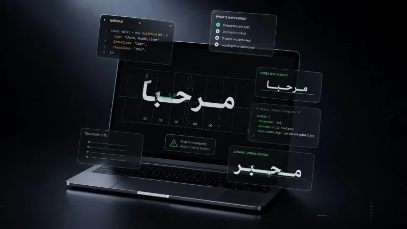
A line is a function of resolved font metrics, which is also why an animation splitter cannot run before the fonts arrive — splitting text in a joined script.
src/styles/locale/arabic.css:286-326
What a size-adjust drags behind it
A metric multiplier is never local. Because size-adjust scales the font's ascent and descent along with the outlines, Zain's content box at 112 per cent is 1.859em — so any element set at line-height 1 has negative half-leading, and its ink hangs out of its own line box in both directions.
The button roll-up on this site clips its label to a window cut at 94 per cent of that box, which is comfortable for Quicksand and not for Zain. Measured on the Zain Bold outlines, final yeh descends to -0.46625em and ain to -0.41380em; at 112 per cent that is -0.5222em and -0.4635em below the baseline of a 1em box. The window took the dots off the bottom of the word, and the Golden Master's Arabic contact link rendered a different letter — a misspelling of the owner's own words, in a link label, in production.
/* src/styles/locale/arabic.css, abridged */
html[lang='ar'] :is(.btn-text, .text-eyebrow) {
  --ar-label-lh: 1.55;   /* was 1, and 1 clipped */
  --text-offset: 2em;    /* where the twin's ink starts */
}

html[lang='ar'] .text-clip-w {
  /* Latin cuts at 94%; Zain's descenders need 114% */
  clip-path: polygon(0 -2%, 0 114%, 100% 114%, 100% -2%);
}

/* the window at 114% of a 1.55em box reaches 1.767em,
   and the twin's ink begins at 1.845em. */
The browser harness that guards the Arabic routes cannot see this class of defect. It compares the bounding boxes of consecutive line elements at four viewports, and two lines of Arabic collide ink to ink, never box to box — so the fontTools derivation is the stronger test and the harness is the weaker one. Saying it the other way round inverts the whole point of measuring the outlines.
A clipped descender is one of the defects logical properties do not reach on their own — seven right-to-left bugs.
@layer utilities · order.json:88
How to derive a size-adjust you can defend
None of the numbers above transfer. They are Zain against Cairo, at one site's sizes, for two roles that site happens to have. The method transfers, and it is seven steps long — the first three are the article, and the last four each cost this repository a defect.
- Name the role and its glyph Decide out loud which feature each role is read at: prose at the tooth, display at the alef. Write the reason into the stylesheet, because it is the only part of this that a later reader cannot recover from the declarations themselves.
- Measure ymax, not the OS/2 table Read the glyph bounding box in the outgoing face and the incoming one, and divide each by its own unitsPerEm. Never assume 1000: Zain's em is 800 units, and every ratio here is wrong by a quarter if you divide by the wrong number.
- Divide the outgoing height by the incoming one That quotient is the size-adjust. 0.500 over 0.4475 is 1.117, which ships as 112 per cent. Do not round a measured quotient into a rounder one before you have worked out what the rounding costs in ink.
- One synthetic family per role Declare a separate family for each size-adjust, even when two of them point at the same file. Two families over one .woff2 is not redundancy — the descriptors are what make a line box the height it is, and merging them silently changes one of the roles.
- Leave the overrides out, or state them in the incoming face's terms An ascent-override written as the ink percentage you want is multiplied by the size-adjust, so it overshoots by exactly that factor. If the incoming face already lands close to the outgoing box once adjusted, the honest move is to declare no override at all.
- Re-derive every line-height afterwards The adjustment moved the ascent and the descent, so every floor the type was tuned against moved with it. Anything that clips, masks or fixes a height has to be re-measured in the same pass, or a descender ends up outside its window.
- Put the locale sheet in a late cascade layer A layer beats specificity, so a section stylesheet cannot outrank a locale rule however tightly it is scoped. Shipping the exception in the section file instead is how this site rendered a heading block at 130.5 pixels where 112.5 was intended.
The boundary of the method deserves stating as plainly as the method. It fixes vertical size and nothing else: the set width moves, the wrap points move, and no single CSS property holds both. And it is a per-face constant, so the whole derivation runs again the day the typeface changes — which, on this site, it did.
Step six is a measurement in its own right, and this site's floors are published with their arithmetic — the Arabic line-height floor.
If you are planning a build in more than one script and would rather settle the typography before the layout, start a conversation.