


structure
Semantic HTML, read before it is seen
Information hierarchy and content that stays understandable without visual effects. Structure, design and behaviour, in that order of importance.
01
The web is where design and code meet most directly for me. I use complete concept projects to explore structure, typography, responsive behaviour, accessibility and interaction as one system.
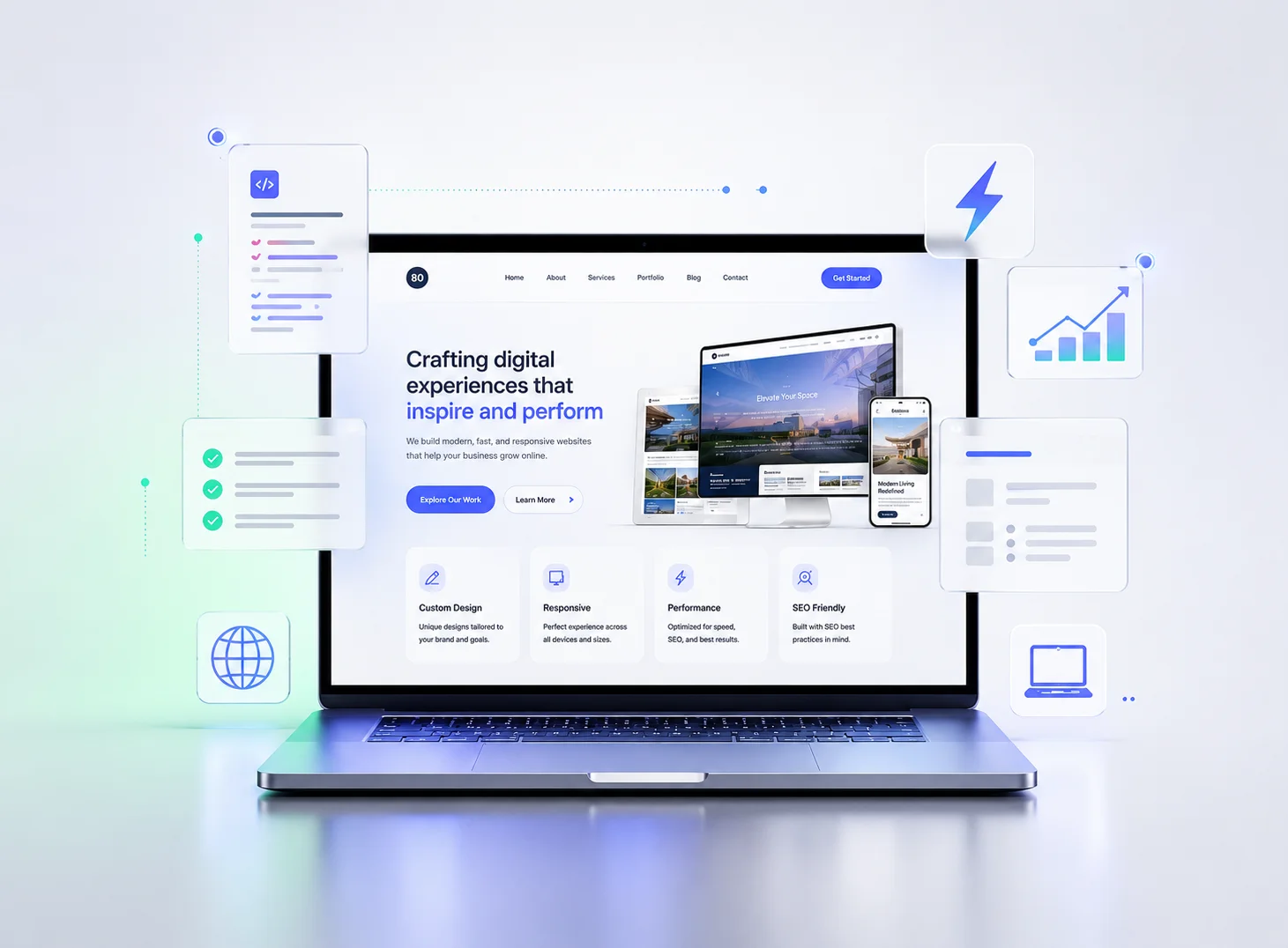
what this is
A finished, complete site of my own design, written by hand. No template bought from a marketplace, no page builder — every one of the ten is a project I set for myself and worked through end to end.
Most of the ten builds on this site started from the same question: what would this look like done properly? A restaurant, a clinic, a SaaS product — each one a chance to work through a real problem end to end, self-set rather than assigned.
structure
Information hierarchy and content that stays understandable without visual effects. Structure, design and behaviour, in that order of importance.
layout
CSS Grid, Flexbox, fluid type. The columns collapse in an order I decided, and the narrowest version is designed rather than survived.
performance
Keeping unnecessary dependencies out, loading media carefully, and understanding what the browser is actually doing.
accessibility
Focus behaviour, contrast, semantic markup, ARIA where necessary — interfaces that do not depend on animation. Walked by hand, key by key.
interaction
Accordions, galleries and forms designed to remain operable with a keyboard and with reduced-motion preferences honoured.
tooling
Most of the ten are hand-written HTML, CSS and JavaScript. Elsewhere I also work in React, Next.js and Vue — the tool follows the question, not the other way round.
what a build consists of
Not a metaphor and not a simplification. Every one of the ten builds in the portfolio is these three files plus its self-hosted fonts — open any of them and read the source, which is the only reason this paragraph is worth anything.
Headings that descend one level at a time, landmarks that mean what they are called, every control a real button or a real link. This is the file a screen reader reads and a search engine indexes, which is why nothing decorative is allowed to live in it.
Declared once at the top as named values, then used everywhere. Change eight of them and the whole site changes mood. Where a contrast pairing is close, the measured ratio is written in the comment beside it.
Written so a missing element is a no-op rather than a thrown error, and so every animation asks first whether you have told your device you want less of it. The page works with any part of this file removed.
That is the point of the number three: the next person to touch it does not need to have met me, and does not need to know a framework I happened to choose.
what I test for
Both columns are the same size on purpose. Knowing where a build's edges are is as much a design decision as anything inside them.
the questions
Not by default, and I would rather say that plainly than dodge it. A hand-built site ships as files, so changing a sentence means editing a file.
There is a real answer worth exploring: an editing layer over the same static build, so named parts of a site become editable in a browser without touching code. It is its own small system — an editor, a login, a deploy step — three more moving parts worth understanding on their own terms.
Because the constraint is the point. Plain HTML, CSS and JavaScript force every decision to be visible — there is no abstraction hiding what a page actually does.
It also means anyone, including a future version of me, can open the files and read exactly what they say. No dependency to update, no build step to break, nothing standing between the source and the browser reading it.
By checking, which takes about ninety seconds and needs no special tooling. Put the mouse down, press Tab, and watch where the outline goes.
The standard here is built to WCAG 2.1 AA practice — a description of how the work is done, not a badge, because a badge is not an audit. What I can offer instead is a measurement of a real site with its date and method attached, so it is checkable rather than taken on faith.
The method is the same every time: an automated scan across every route at two viewports, then a keyboard walk with real key presses where the active element is read back after each stop, then contrast measured pair by pair with the failures listed rather than summarised.
the work
All ten are self-initiated, all ten are live, and every one has a write-up saying what it set out to do and what fought back. These three are here because they look nothing like each other. If one happens to be your industry, that is a coincidence rather than the reason it is on this page.
Architectural brokerage, 2025
Four colour values, three type weights and a great deal of deliberate empty space. Restraint is the hardest of the three to imitate.
Restaurant, 2021
An editorial print magazine that happens to serve dinner. Grid-led, warm, and about as far from the SaaS page as the same pair of hands gets.
Observability SaaS, 2026
Precision dark, not one photograph in the build, and a command palette that is a real one — focus held, arrow keys, escape.
See all ten builds — each one runs in the browser you already have open.
websites
Every principle on this page is easier to see than to read about. The ten projects show the same discipline applied ten different ways — and if you would rather ask about one of them than read another paragraph, that is what the second link is for.
Please rotate your device,
This is a vertical build.