

01 · Overview
Selling software with software
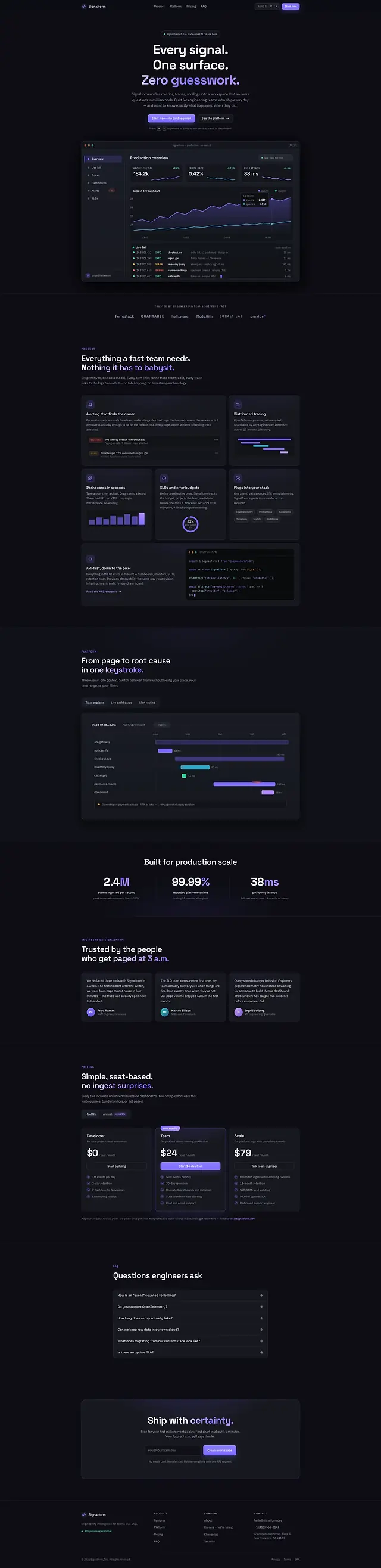
Observability tools are bought by people who will judge the product by the marketing site's p95. So this site is not a page about a dashboard — it contains one. The hero panel is hand-built SVG: browser chrome, a throughput chart, an error-rate sparkline, a p95 latency readout and a log tail that scrolls. No screenshot, no stock render, no product video.
That decision cascades. With no image files at all, the entire page weight is markup, and the visual language has to come from structure — a 14-pixel radius, one violet, a three-step neutral ramp, and a great deal of restraint about when anything is allowed to glow.
02 · The idea
Answer in milliseconds, say so in milliseconds
For this concept I imagined Signalform as a company whose promise is every signal on one surface, with no guesswork. The site had to demonstrate that rather than assert it, which meant the interface had to be reachable the way engineers actually reach for things: a command palette on ⌘K, tabs that switch without a page load, and a pricing toggle that answers a question instead of opening a sales form.
Three decisions came out of that, and the rest of the build is those three applied everywhere.
-
Keyboard first
A real command palette — focus held inside it while it is open, arrow-key navigation, number shortcuts and a scroll lock — rather than a search box dropped into a modal.
-
Show the product
Fourteen inline SVGs carry the dashboard, the charts and every customer logo. Nothing on the page is rasterised, and there are no image files to request.
-
Dark that stays legible
A three-step neutral ramp with the faintest text token pinned at 5.72:1 on the background and 5.23:1 on the panels, with both ratios written into the stylesheet beside the value.
03 · Goals
The brief, as constraints
-
Look like the product
The same radius, the same panel shadow and the same type scale as the app it advertises, so the step from site to trial does not feel like a change of address.
-
Ship no images
Zero photography and zero raster assets, so the page is quick on conference wifi and sharp on any display, at any zoom.
-
Be operable without a mouse
Palette, deep-dive tabs, FAQ accordion and pricing toggle all driven from the keyboard, each carrying the ARIA state that matches what it is actually doing.
-
Never trap anyone
The overlay locks background scroll and cycles focus while it is open, and hands focus back to the trigger the moment it closes.
04 · Build order
Built in ten numbered modules
The script is one IIFE holding ten numbered blocks, each self-contained and each guarded so a missing element is a no-op rather than a thrown error. The page works with any subset of them present, which is also how it was built: one module at a time, in this order.
-
Tokens and the neutral ramp
Twenty-two custom properties: a background, two surfaces, a sunken tint, three text weights, three violets and four status colours, with the contrast ratios kept in comments next to the values that needed checking.
-
The drawn dashboard
Chrome, axes, series and a log tail, written by hand into the markup rather than exported, so the panel scales, follows the tokens and costs nothing to download.
-
Layout at five breakpoints
Five media queries across 45.9 KB of CSS. The bento and pricing grids are auto-fit, so they reflow without being told to.
-
The interaction modules
Header state, mobile navigation, offset anchors, scroll reveals, the bento cursor light, count-ups, deep-dive tabs, the pricing toggle, the FAQ accordion and the closing form.
-
The command palette, last
Built only once everything it navigates to already existed, so its index is the real page rather than a hard-coded list that would drift the first time a section moved.
05 · Architecture
The shape of the thing
The site models the product's own pipeline and says so out loud in the platform section. That diagram is inline SVG, and every connector in it declares a pathLength of 100, so one scroll-driven custom property draws all four of them through calc() windows. One write per frame, one diagram.
It is the heaviest of the ten at 118.4 KB across three files, and it still has no bundler, no dependency and no build step. The browser is the only runtime it has ever needed.
signalform/
- index.html
- 53.9 KB
- 5 sections, 14 inline SVG, 0 images, 1 form
- styles.css
- 45.9 KB
- 22 custom properties, 5 media queries, 1 reduced-motion block
- script.js
- 18.5 KB
- 609 lines in 10 numbered modules
The stack
- Semantic HTML
- CSS Grid
- Custom properties
- Inline SVG
- pathLength
- IntersectionObserver
- Space Grotesk
- IBM Plex Sans
- Vanilla JavaScript
Accessibility surface
- Focus trap
- Focus returned to trigger
- aria-expanded
- aria-selected
- aria-pressed
- aria-live
- Roving tabindex
- Escape to close
- Reduced motion
06 · What fought back
Problems, and what beat them
-
Challenge
Locking background scroll for the palette with overflow: hidden removes the scrollbar, and the whole page jumps sideways the instant the overlay opens.
Solution
Measure the scrollbar width before locking and pay it back as padding on the same element. The page does not move by a pixel, opening or closing.
-
Challenge
A hand-drawn dashboard has to stay readable from 360 px to 2560 px, and a single fixed viewBox makes seven-pixel labels either illegible or enormous depending on which end you are at.
Solution
The panel is several small SVGs inside a CSS grid rather than one large one. The chrome scales, the type does not: each chart keeps its own aspect and every label stays in document type.
-
Challenge
Count-up statistics are a cliché that also breaks accessibility — the number restarts on every scroll pass, and assistive technology announces each intermediate value on the way.
Solution
Each counter fires once, from an observer that unobserves itself, and under prefers-reduced-motion it prints the final value immediately instead of animating towards it.
-
Challenge
Anchored navigation lands the target underneath the sticky header, so the heading you just clicked is the one thing you cannot see.
Solution
A shared scrollToTarget() subtracts the measured header height and moves focus to the destination, so keyboard and pointer users arrive at the same place rather than two different ones.
07 · Worth keeping
The parts worth keeping
-
⌘K from anywhere
Jump to any service, trace or dashboard from any point on the page, with a real focus trap, arrow keys and number shortcuts.
-
The drawn dashboard
Throughput, error rate, p95 latency, ingest and a scrolling log tail — all markup, all following the page tokens, all sharp at any pixel density.
-
Deep-dive tabs
Traces, alerts and boards swap in place with aria-selected kept true and a roving tabindex, so the tab strip is one stop rather than three.
-
Pricing that answers
A monthly and annual toggle carrying aria-pressed that rewrites the figures in place, rather than a button that opens a contact form.
-
Cursor light
One pointer listener and two custom properties light six bento cards. It is switched off on coarse pointers and under reduced motion.
-
Status colour, sparingly
Cyan, green, amber and red exist only where a state is being reported. Nothing decorative on the page is ever allowed to borrow a status colour.
08 · Run it live
Run it here
The real build, embedded and running — try ⌘K once it loads. Nothing is fetched from it until you ask, so the page you are reading stays as light as it looks.
Skip the live preview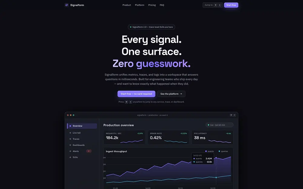
The real build, running in the page. The live preview is an embedded page. Press Escape to leave it.
Open it full screen