


01 · Overview
A magazine that serves dinner
For this concept I imagined Ember & Oak as a wood-fired restaurant that has been cooking over oak in Portland since 2016 — the kind of room that already has a voice, and that most restaurant websites talk over. So the page stops performing. It sets the restaurant the way a food magazine would: a masthead, a standfirst, ruled columns, plates that run to the edge of the paper, and a menu you read rather than scroll past.
Everything on it is typographic. There is no hero video, no parallax showreel and no scroll-jacking. The only motion in the whole build is an eight-pixel rise on section entry and a slow drift on the masthead photograph, and both stop dead when the visitor asks for reduced motion.
02 · The idea
Seasonal, unhurried, on paper
The concept was fixed by one line I wrote for the restaurant: seasonal menus written by the Willamette Valley, cooked over oak, served unhurried. Unhurried became the design constraint — nothing on the page may hurry the reader, not the transitions, not the type, not the calls to action.
Three rules follow from it, and the whole build obeys them.
-
Type leads, images support
Fraunces at a variable optical size for display, Libre Franklin for text. The twelve photographs are set into the columns like plates in a magazine rather than used as backdrops.
-
Slower than expected
One easing curve for the whole build — cubic-bezier(0.33, 1, 0.68, 1) — and reveals that take most of a second to land.
-
No pressure
One reservation form, at the foot of the page, after the menu, the chef, the room and the press have made the case. No sticky booking bar following you down.
03 · Goals
What the page had to do
-
Make the menu readable
Starters, mains and desserts as three real sections with dot leaders and prices — the printed card, on screen, at any width.
-
Sell the room without a slideshow
Twelve photographs placed into the grid at the moment the copy earns them, rather than a carousel nobody advances.
-
Take a booking in one screen
Six fields, a polite live region for the confirmation, and focus moved to the message so a screen-reader user hears the outcome instead of only seeing it.
-
Stay under a hard weight budget
No framework, no carousel library, no icon font. The entire interaction layer had to fit in a few kilobytes of hand-written JavaScript.
04 · Build order
How it was built, in order
The page was written the way it reads: structure first, then the type system, then colour, then the two pieces of motion. Nothing was styled before it was marked up, and nothing moved before it was legible standing still.
-
The semantic skeleton
Seven sections, each with an aria-labelledby pointing at its own heading: story, menu, chef, gallery, private dining, press and reservations. The document outline was correct before a single rule was written.
-
The token block
Sixteen custom properties on :root — seven colours, four ink alphas, a dedicated field-border token, two families, one easing curve and the masthead height. Contrast ratios sit in comments beside the values that needed checking.
-
The column grid
CSS Grid with a named measure column, so long-form copy is capped at a comfortable line length while plates and the menu span wider tracks.
-
Fifteen breakpoints of proof
Fifteen media queries, each written against a real reflow problem rather than against a device name. It is the most in the set, and the menu is the reason for most of them.
-
Under six kilobytes
Mobile navigation, scroll reveals, the masthead shadow, the hero drift and the reservation form: 165 lines in one IIFE, with a matchMedia guard at the top.
05 · Architecture
Three files, nothing else
There is no bundler, no transpiler and no node_modules. The site is three files served as written, and the browser is the only runtime it has ever needed.
ember-and-oak/
- index.html
- 34.4 KB
- 7 sections, 12 photographs, 0 inline SVG, 1 form
- styles.css
- 30.8 KB
- 16 root custom properties, 15 media queries, 2 reduced-motion blocks
- script.js
- 5.8 KB
- 165 lines: navigation, reveals, masthead, parallax, form
The stack
- Semantic HTML
- CSS Grid
- Custom properties
- IntersectionObserver
- matchMedia
- Fraunces
- Libre Franklin
- Vanilla JavaScript
Accessibility surface
- aria-expanded
- aria-controls
- aria-labelledby
- aria-live
- Escape to close
- Focus moved on submit
- Reduced motion
06 · What fought back
Problems, and what beat them
-
Challenge
A printed menu uses dot leaders to carry the eye from the dish to the price. On the web that is usually faked with a row of full stops, which a screen reader then reads aloud, one at a time.
Solution
The leader is a repeating background gradient on a flex spacer. It is decoration rather than content, so assistive technology never encounters it, and it stretches correctly at any width.
-
Challenge
Cream on cream is the entire palette, and low-contrast palettes are where accessibility quietly fails — particularly on form borders, which are non-text content and still carry a 3:1 requirement.
Solution
Two accents instead of one. #C4552D paints rules and fills; a darkened #A8431F is reserved for accent text at 5.54:1 on cream. Field borders got their own token at 3.6:1, with the ratio written in the stylesheet beside it.
-
Challenge
Reveal-on-scroll animations hide content by default. If the script fails, or simply never runs, the page is blank paper.
Solution
The hidden state is scoped behind a class the script adds itself. No script, no class, no hidden content: the page renders in its settled end state and reads perfectly.
-
Challenge
A parallax masthead is the fastest way to make a restaurant site feel cheap, and the fastest way to make it stutter on a mid-range phone.
Solution
One transform, driven by scrollY at a coefficient low enough to register as depth rather than movement, and skipped entirely under prefers-reduced-motion.
07 · Worth keeping
The parts worth keeping
-
The Autumn Menu
Three courses set as a printed card, dot leaders and all, reflowing to a single readable column on a phone without losing the price alignment.
-
From the Dining Room
A photo grid that breaks its own rhythm — different spans, different heights — so it reads as a magazine spread rather than as a gallery widget.
-
Notices & Reviews
Press quotes set as pull quotes with the publication in small caps, borrowing the one typographic device a restaurant actually earns.
-
A booking, not a funnel
Six fields, inline validation, a polite live region for the confirmation and focus moved to it. No modal, no upsell, no countdown.
08 · Run it live
Run it here
The real build, embedded and running. Nothing is fetched from it until you ask, so the page you are reading stays as light as it looks.
Skip the live preview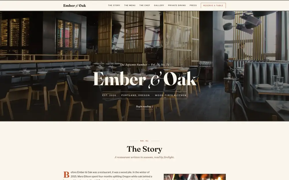
The real build, running in the page. The live preview is an embedded page. Press Escape to leave it.
Open it full screen