

the mark
Drawn on a grid, then tested where it will live
At the size it will actually be used and at the size it will actually be seen — a browser tab, a stitched shirt, a sign across a car park. A mark that only works on a slide is not finished.
04
Before an interface becomes interactive, it still has to communicate. Graphic design is where I explore that foundation through type, colour, composition and identity. It is explored on its own or alongside a build — the one discipline here that does not need a website attached to it, and the one with real commissioned work behind it.
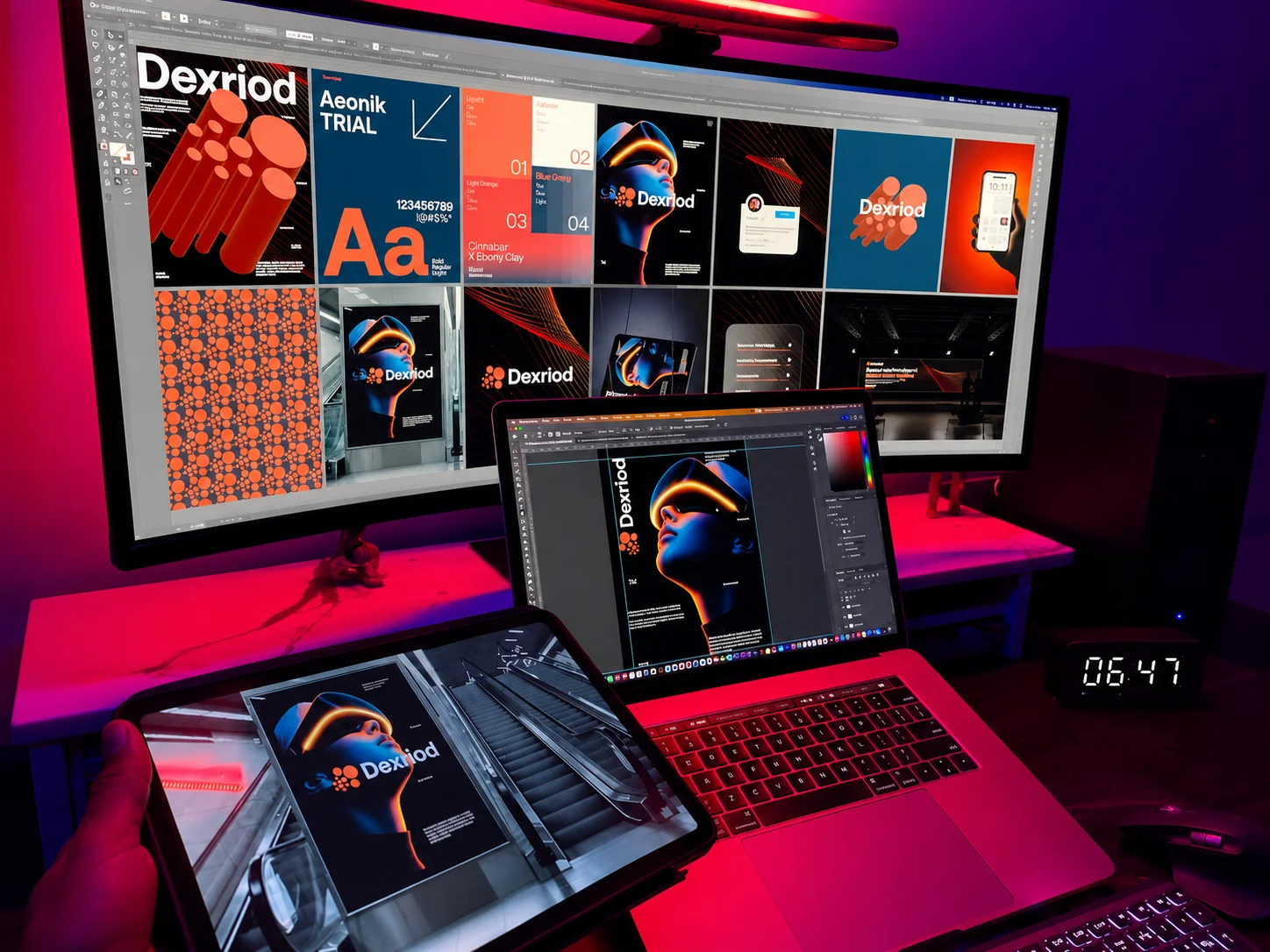
the system
A simple list would say logo, palette, typography, layouts. That tells you what exists and nothing about whether it holds together. So here is the same system described the other way round — six things, and the last one is the difference between a picture and an identity.
the mark
At the size it will actually be used and at the size it will actually be seen — a browser tab, a stitched shirt, a sign across a car park. A mark that only works on a slide is not finished.
the palette
Contrast checked rather than eyeballed, and the pairs that fail recorded as failing. This is the sheet that stops a brand colour carrying body text on a brand's own website and quietly failing.
the type
Named, properly licensed, and with a scale somebody can follow. The second weight nobody licensed is the most common way a new identity falls apart in month three.
the pattern
Generated from the mark rather than bought separately, so a bag, a wall or a background is recognisably the same brand without repeating the logo eleven times.
the applications
Without being the same picture ten times. A billboard, a shop sign, a story, a menu, a letterhead — variation inside a system, which is only possible because there is a system.
the rights
Exclusive, worldwide, permanent usage rights granted in writing, and the source files in the format they were made in rather than a flattened export. A right nobody names does not transfer.
what arrives
An identity sheet is made in one order, and every step after the first is checked against the one before it. That is what makes six surfaces one brand rather than six drawings that happen to share a colour.
The grid, the angles and one stroke width. Boring on purpose: every decision that follows is checked against it.
Two strokes on the grid. A mark that does not survive as two strokes is not rescued by colour later.
Five values and the proportion each is allowed to take — so the brand colour is a ratio, not a preference.
A display face and a working face, set on the construction's own lines rather than beside them.
The mark's own angle, repeated. Texture for any surface that needs filling, and it cannot clash with the mark it came from.
A billboard, a fascia, a story, a menu, a cup, a bag. None of them is a new drawing — that is the point, and it is what the sheet is for.
how it is taken on
This is the one discipline here with real work behind it, and it stands on its own. No website has to be attached, and it is not treated as an extra line inside a larger project.
It travels the other way too, and only for a reason visible in the material itself. If a mark fails on screen — a brand colour that fails contrast the moment it carries text, no version for a dark background, a wordmark that dissolves at sixteen pixels — that is an observable problem, and it is the only circumstance where identity work belongs inside a conversation about a website. If none of those is true of a given brand, it does not come up.
Where a build is part of it, the identity and the site are made together rather than handed between two people. The websites page describes that half.
what I test for
Same size, same weight, both columns. The right-hand one is where a design project usually goes wrong, because most of it is work somebody else does better and everyone assumes is included.
the question
A generated mark is a picture, and most of the time the picture is genuinely fine. What it skips is everything a picture is about to run into once it has to survive outside a slide.
A brand colour that fails contrast the first time it carries text on a website. A second weight of the typeface nobody licensed. A version for a dark background that does not exist. Each of those is cheap to decide at the start and expensive to discover later — and each is a craft lesson, not a sales pitch.
So the comparison worth making is not one mark against another. It is what happens the first time somebody else — a printer, a sign maker, the next designer — has to use it without being able to ask. That is what construction is for, and it is what the sheet above is showing.
commissioned work
This is the one area here with real commissioned work behind it. The names are on the sheets because on identity work the name is the deliverable — it is the one place on this site where a client appears, and it appears because you cannot show a mark without showing whose it is. These three share nothing except the method behind them.
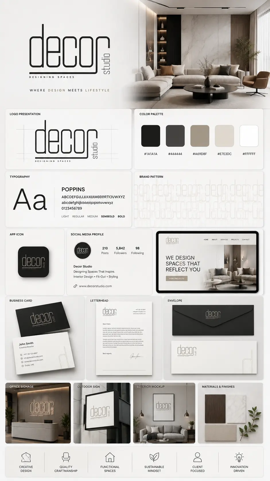
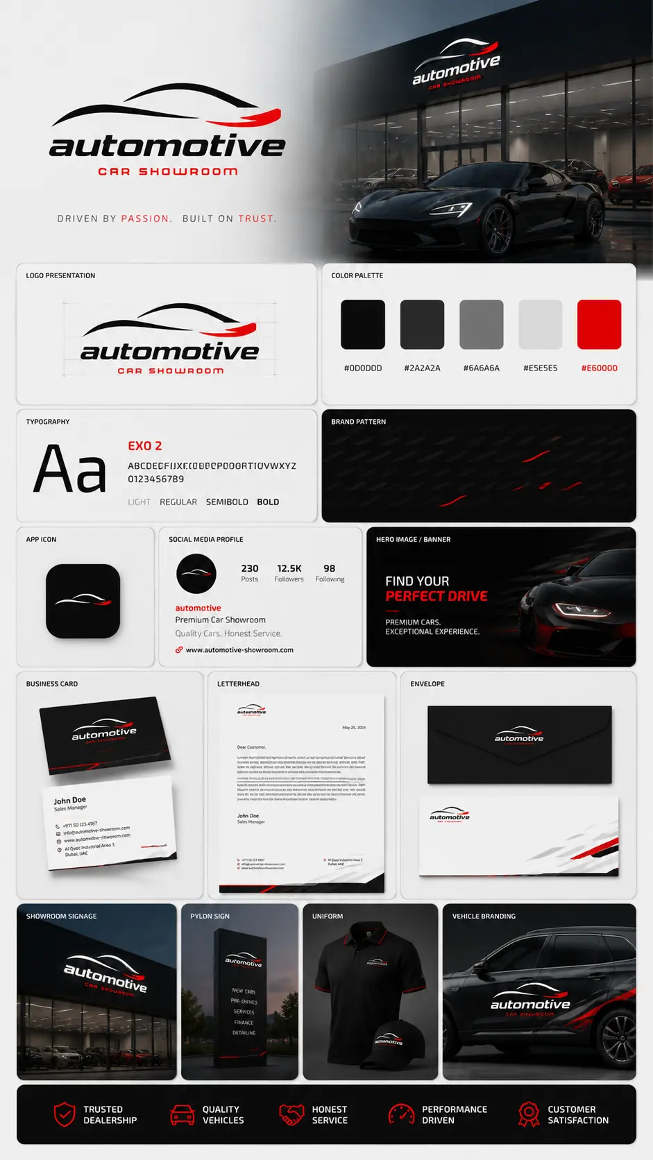
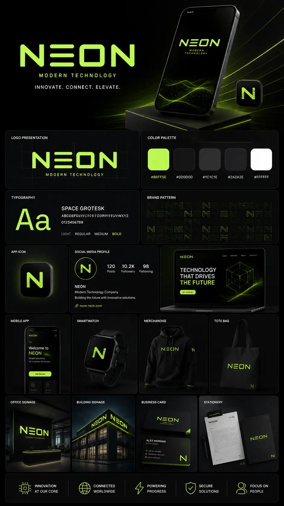
Each sheet is one system taken all the way to the surfaces it has to live on. None of the three shares a face, a palette or a grid with either of the others.
the same eye, on screens
The ten websites in the portfolio carry ten separate art directions, which is the same muscle used on a different surface. These three are named rather than left to the index, because a claim about range is worth making checkable: each one solves a different art-direction problem, and none of them looks like the other two.
Restraint, 2025
Four colour values, three type weights and a great deal of deliberate empty space. Taking decisions away and having the page still hold is the hardest of the three.
Type and grid, 2021
An editorial print magazine that happens to serve dinner. Composition and typographic hierarchy carry the whole identity, with no mark doing the work for them.
A saturated system, 2023
High contrast and acid colour held consistent across a whole interface — the opposite discipline to restraint, and just as easy to get wrong.
See all ten builds — if you want to know whether the range is real.
graphic design
Three sheets of commissioned work sit above and the ten builds carry the same art-direction muscle onto a different surface. If what you have is a mark that fails on screen, or a brand that has never had a system written down, that is worth a conversation.
Please rotate your device,
This is a vertical build.