


01 · Overview
Subtraction as the whole method
For this concept I imagined Arke as a brokerage representing a small number of design-led homes each year, sold with discretion and without spectacle. Every instinct a property website has — the gallery carousel, the mortgage calculator, the enquire-now bar — is spectacle. So this build is defined by what is not in it.
There are four colours: white, ink, a single warm grey and a hairline. There are no cards, no filled surfaces, no shadows, no rounded corners and no icons — not one inline SVG in the file. Sections are separated by a rule and by roughly twice the vertical space of any other page in this set. At 21.6 KB the stylesheet is the shortest of the ten by nine kilobytes, and that is the design.
02 · The idea
The best homes wait to be understood
The brokerage's own line — the best homes do not announce themselves, they wait, precisely, to be understood — is a design brief disguised as copy. It rules out anything that announces: movement, contrast, colour, weight.
-
One typeface, three weights
Archivo at 100 for display, 200 for a listing name, 300 for the wordmark. Nothing on the page is bold. The hierarchy is size and space, never weight.
-
Opacity only
Reveals fade and never translate — a deliberate refusal. A brokerage selling stillness should not have things sliding around.
-
Photography in greyscale
Nine images, all greyscale at rest, with colour arriving only under a hover or an explicit touch. It is the only colour the page ever shows.
03 · Goals
What the page had to do
-
Present three houses properly
Location, architect and year, a name, a price and the plain facts of the house. Enough to qualify a buyer and nothing that pressures one.
-
Explain a private process
Four steps — the conversation, the shortlist, the viewing, the close — that make discretion sound like method rather than evasion.
-
Feature one house at length
The Kessler Pavilion gets a full section, which is the depth signal a grid of thumbnails can never send.
-
Begin a conversation
A consultation form with three fields: name, email, and what you are looking for. Not an enquiry funnel, an introduction.
04 · Build order
How it was built
-
The four tokens
White, ink, grey, hairline — written first and never added to. Eleven custom properties in total, and the other seven are type, spacing and timing.
-
A vertical scale, not a horizontal one
With no colour and no weight to work with, the only remaining variable is space. Section padding is one clamp from 4.5rem to 10rem, and the spacing scale got more attention than anything else in the build.
-
The nav that removes the page
Opening the mobile menu marks the main content and the footer inert, and above 900px the panel does not exist, so the open state is released with it.
-
Statistics without decoration
Count-ups set in the same weights as everything else — no units in a different colour, no icons, no progress rings — with the final figure also written out for assistive technology, so the animation stays decorative.
-
Deleting
The last pass removed a divider style, two hover states and a hero animation. The stylesheet ended that day smaller than it started.
05 · Architecture
Three files
Three files and 55.8 KB of source in total — the smallest build in the set, and the smallest stylesheet in it. There is no bundler and no dependency, so the reduction had to happen in the source rather than in a build step.
arke-estates/
- index.html
- 22.0 KB
- 5 sections, 9 photographs, 0 inline SVG, 1 form
- styles.css
- 21.6 KB
- 11 custom properties, 4 of them colour, 5 media queries
- script.js
- 12.2 KB
- 353 lines: nav, inert, reveals, counters, form
The stack
- Semantic HTML
- CSS Grid
- Custom properties
- inert
- IntersectionObserver
- matchMedia
- Archivo
- Inter
Accessibility surface
- inert background landmarks
- aria-expanded
- role=alert
- aria-describedby
- aria-invalid
- Escape to close
- Focus restore
- Reduced motion
06 · What fought back
Problems, and what beat them
-
Challenge
Ultra-light type at display size is elegant on a retina laptop and close to unreadable on a low-density screen at 100% zoom, where the stems thin out to nothing.
Solution
Weight 100 is permitted only above a size threshold — section titles start at 2.5rem — and body copy never goes below 400. The lightest weights exist purely as display, which is what they were drawn for.
-
Challenge
Hiding a mobile menu visually still leaves its links in the tab order, so a keyboard user tabs through an invisible panel into nothing.
Solution
The main content and the footer are marked inert while the panel is open, and released above 900px where the panel no longer exists. One attribute replaces a manual tabindex sweep that would have needed maintaining forever.
-
Challenge
Inert alone did not contain the keyboard, and the gap only showed up when it was measured rather than read: three focusable stops still sat outside the panel, and tabbing off the last link left the page.
Solution
Two of the three are correct and stay — the wordmark and the toggle paint above the panel and the toggle is the close button — so the boundary became the header and the panel together, with the Tab cycle wrapping at both of its ends.
-
Challenge
The muted grey was the whole secondary voice of the page, and at the size the micro labels use it, it did not pass: 3.62:1 on white, across every one of its consumers.
Solution
It was deepened to 4.63:1. All six consumers are a text colour, so nothing but the weight of that grey moved, and the reason is written into the stylesheet above the value.
07 · Worth keeping
The parts worth keeping
-
Three houses, chosen slowly
A listings section that lists three, in keeping with the brief's imagined scarcity. The layout refuses to pad it, and the price is the largest thing in the row — set at weight 100 in tabular figures.
-
Said quietly, meant entirely
Two fictional client words set at body size, each with a 56-pixel greyscale portrait and a single line of attribution. No star ratings, no logo wall.
-
The Kessler Pavilion
One featured house given a full section, proving the brokerage can talk about architecture rather than square footage.
-
Begin with a conversation
The contact section's heading is the entire sales strategy, and the form has three fields to match — with one error line whose pointer moves to whichever field failed, rather than sitting on both.
08 · Run it live
Run it here
The real build, embedded and running. It loads on demand, so nothing is fetched from the brokerage until you ask for it.
Skip the live preview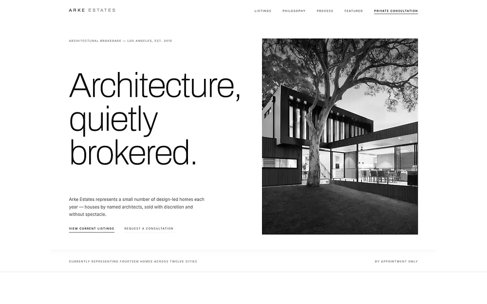
The real build, running in the page. The live preview is an embedded page. Press Escape to leave it.
Open it full screen