

Chapter 01 / 06
The anatomy of a useful page
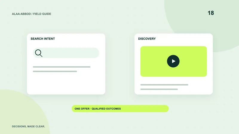
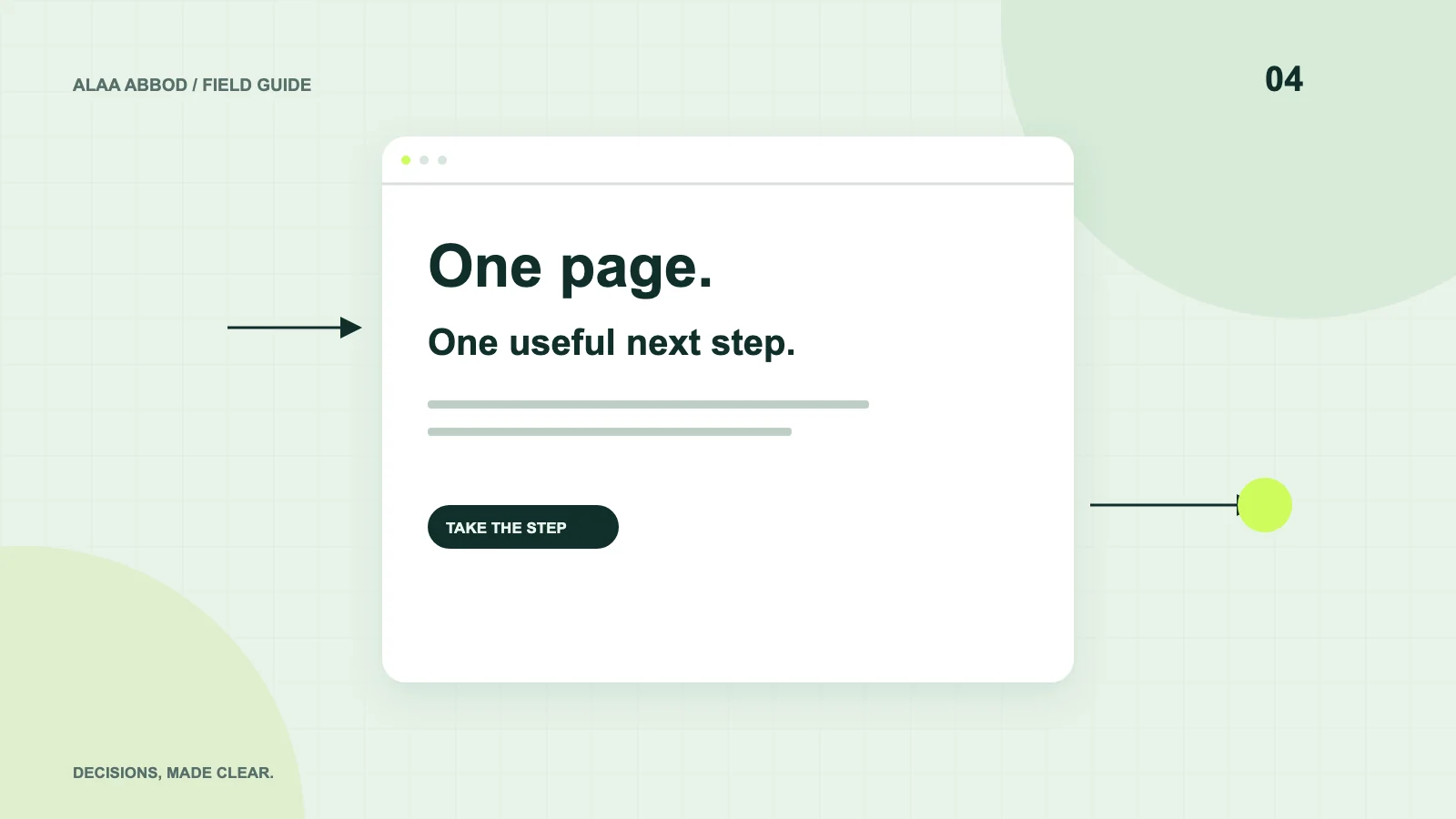
Start with a buyer-specific headline and a concrete explanation of the offer. Place a visible primary action beside the answer to the most immediate objection. Then show the workflow or product, credible proof, relevant terms and a second opportunity to act after the explanation.
For a demo request, describe its duration and what will be covered. For a service enquiry, say which projects fit and what information helps you reply. For a store campaign, make delivery, availability and return information easy to find. A landing page can be focused without hiding facts that affect the decision.
- Understand Audience, problem and offer.
- Evaluate Workflow, evidence and limits.
- Decide Terms, risk reduction and the next step.
Chapter 02 / 06
Two illustrative examples, not claimed client results
For a German B2B software pilot, the primary action could be a workflow review. Show an annotated screen, list prerequisites, name the pilot scope and ask for work email and company context. A lengthy product catalog would distract from that conversation.
For a Gulf company entering Germany, the page should explain local delivery capability, communication languages and implementation responsibilities. Arabic typography and a German equivalent page support trust, while a generic English-only form may leave important purchasing questions unanswered.
| Offer | Useful proof | Accurate CTA |
|---|---|---|
| B2B pilot | Workflow and pilot acceptance criteria | Discuss a pilot |
| Design service | Relevant working examples and delivery scope | Request a scope review |
| Retail promotion | Product details, stock and fulfillment terms | View the offer |
| Workshop | Agenda, prerequisites and named instructor | Reserve a place |
Chapter 03 / 06
Budget the page as a complete campaign asset
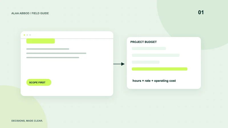
Assume 6 hours for discovery and copy structure, 8 for design, 12 for implementation and 6 for QA and measurement setup. At an illustrative €100/hour, 32 hours equals €3,200 net. This excludes ad spend, licensed assets, extensive copywriting and external subscriptions, and it is not a fixed quote.
A page using existing design components may need less effort. A multilingual page with CRM routing, consent controls or unusual interactions needs additional work. Ask whether the quote includes the thank-you state, responsive checks and actual lead delivery.
Chapter 04 / 06
Forms and proof deserve practical scrutiny
Use visible labels, helpful errors and a clear confirmation. Protect the endpoint server-side. Explain why you need each field; a project budget field may improve qualification while an unnecessary phone requirement can block a legitimate prospect. There is no universal ideal field count.
Use testimonials only with real permission and context. An unattributed sentence or an invented logo is not social proof. If you have no testimonials, show your process, qualifications and an honest sample of the work instead.
Chapter 05 / 06
Performance is part of the buying experience
Compress the hero image, reserve its dimensions and avoid loading every advertising integration before it is needed and permitted. Check the page on a real narrow screen and a slower connection. Important text should remain readable while optional visual effects initialize.
Keep the CTA reachable with the keyboard and readable at zoom. An animated layout shift near the action can become an accidental click. Smoothness is useful only when it supports the visitor’s task.
Chapter 06 / 06
Test a hypothesis, not a collection of random changes
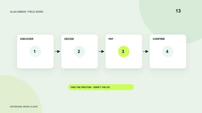
Define the question first: does a clearer pilot scope increase qualified enquiries, or does showing delivery cost earlier reduce abandoned purchases? Select one main outcome and guardrails, such as lead quality or refund rate. Record audience, dates and changes.
Small traffic volumes rarely justify many simultaneous variants. Start with usability observation and a large, defensible change. When running A/B tests, choose the duration and analysis method before seeing results; do not stop the moment one variant looks better.
For implementation: Explore the relevant service.