



01 · Overview
The joke that turned into the method
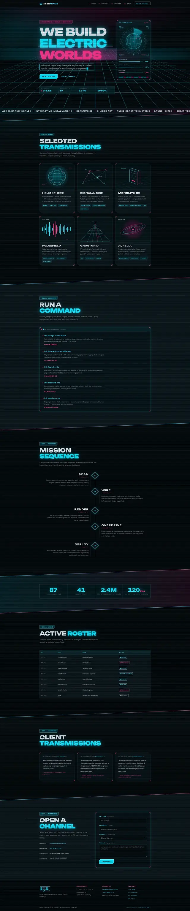
For this concept I imagined a Berlin studio that sells immersive WebGL work and realtime 3D. The obvious site for it is a canvas with a shader in it. The more interesting one asks a harder question: how far can you get with no canvas at all?
All the way, it turns out. The perspective grid, the chamfered HUD panels, the scanlines, the chromatic-aberration glitch on the headings, the magnetic buttons and the live readouts are CSS and nine inline SVGs. A studio that can build a convincing realtime interface out of gradients and clip-paths has made an argument about craft that a shader never could.
02 · The idea
No canvas, no shader, no image
The rule fitted on one line: nothing on this page may be a photograph, a video or a 3D runtime. Three decisions follow from it, and the rest of the build is those three applied to every component on the page.
-
The chamfer
One clip-path polygon cutting two opposite corners, applied to every panel, chip and button. The cut size is a variable, so the chamfer scales with the component instead of being redrawn for each one.
-
Two channels
Cyan carries structure, magenta carries state, and nothing borrows the other's job. The glitch on the headings is simply those two channels offset by four hundredths of an em.
-
Readouts that move
Uptime, frame time and node count drift on a timer that stops the moment the tab is hidden or motion is reduced.
03 · Goals
Mission parameters
-
Look expensive, weigh nothing
No photography, no video, no 3D runtime. The heaviest asset in the whole build is the 51.9 KB stylesheet, and the browser draws everything it describes.
-
Six transmissions
A selected-work grid where every tile is generated in the browser — the studio's own claim about realtime work, honoured literally by its own website.
-
A crew, not a leadership team
Twelve humans, one studio dog, zero account managers. The roster reads as a personality test rather than an org chart.
-
Open a channel
A contact form with per-field error IDs, so every validation message is programmatically tied to the input it belongs to rather than floating near it.
04 · Build order
Mission sequence
The look was built before the behaviour: the tokens first, then the clip-path system, then the glow, and only then the nine modules that make anything move.
-
Thirty-four tokens
The largest token block of the ten: the void, the panel, two channel colours, four glow levels, the chamfer size, the skew angle and the scanline tint.
-
The clip-path system
The cut is a variable rather than a fixed polygon, so one chamfer definition serves panels, chips and buttons and scales with each of them.
-
Glow without filters
Box-shadow for the halo, drop-shadow only where a chamfer would crop one. Filters are expensive, so the page spends them exactly where a box-shadow cannot reach.
-
Nine numbered modules
Navigation, header state, anchors, reveals, terminal typing, count-ups, the live HUD, magnetic buttons and the contact form: 416 lines in total.
-
The gates
Magnetism requires a hover-capable pointer and a viewport of at least 1100 pixels. The HUD stops on visibilitychange. Neither runs under reduced motion.
05 · Architecture
Three files, and the look lives in the stylesheet
There is no bundler, no dependency and no build step, and — unusually for a page that looks like this — no graphics runtime either. The chamfers, the perspective grid, the scanlines and the glow are all declared in CSS, so the browser draws them whether or not the script ever arrives.
The largest stylesheet of the ten and the largest token block are the same fact stated twice: the identity is authored in the file that also does the layout, rather than exported from a design tool and placed on top of it.
neonframe/
- index.html
- 46.8 KB
- 5 sections, 9 inline SVG, 0 images, 1 form
- styles.css
- 51.9 KB
- 34 custom properties, 4 media queries, 1 reduced-motion block
- script.js
- 13.1 KB
- 416 lines in 9 numbered modules
The stack
- clip-path
- CSS gradients
- box-shadow glow
- drop-shadow
- CSS perspective
- visibilitychange
- matchMedia
- Unbounded
- Chakra Petch
Accessibility surface
- Per-field error IDs
- aria-describedby
- aria-label while typing
- Decorative HUD aria-hidden
- Hover and width gate
- Reduced motion
06 · What fought back
Problems, and what beat them
-
Challenge
Neon on near-black is the least accessible palette in common use. Cyan is bright enough on its own, but the dim greys a cyberpunk interface wants sit well below AA.
Solution
The body text token was lifted until it measured, and the very dim values were confined to decorative HUD labels marked aria-hidden. The look survives intact; nothing a reader actually needs is under-contrast.
-
Challenge
A HUD driven by setInterval keeps ticking in a background tab, burning battery on a page nobody is looking at.
Solution
A visibilitychange listener stops the interval when the tab is hidden and restarts it on return. The same listener stops it when reduced motion is switched on part-way through a session.
-
Challenge
Magnetic buttons that follow the cursor are unusable on touch, and on a small screen they drag the control out from under the finger entirely.
Solution
Two gates rather than one: a hover-capable pointer and a viewport of at least 1100 pixels. The magnetism exists only where there is a cursor and room for it to move.
-
Challenge
A typewriter effect that builds text character by character is announced character by character, and leaves the page empty for anything reading the source.
Solution
The full string ships in the markup and the effect replays it. While it is typing, the element carries an aria-label holding the complete text, and the label is removed once the animation lands.
07 · Worth keeping
The parts worth keeping
-
WE BUILD ELECTRIC WORLDS
Three glitching lines over a CSS perspective grid. No canvas, no shader, no image, and the whole effect is two channels four hundredths of an em apart.
-
Selected Transmissions
Six work tiles, every one of them drawn in the browser. It is the studio's boast about realtime work, taken literally by the page that makes it.
-
The chamfer system
One variable-driven clip-path that scales across panels, chips and buttons, so the page has a structural signature rather than a set of decorated boxes.
-
Active Roster
Twelve humans, one studio dog, zero account managers. The crew section is the pitch, and it needed no photography to make it.
08 · Run it live
Run it here
The real build, embedded and running. It loads on demand — nothing is fetched from it until you ask for it.
Skip the live preview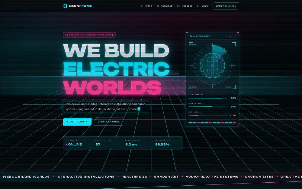
The real build, running in the page. The live preview is an embedded page. Press Escape to leave it.
Open it full screen