


01 · Overview
Restraint as a luxury signal
For this concept I imagined a hotel that opened in 1927 and has never advertised. Every convention of the modern hotel website — the sticky booking widget, the urgency banner, the video autoplaying over the fold — works against that premise. So the page borrows from the one medium the hotel would already trust: its own printed stationery. Everything sits on a centred axis, gold appears only as a hairline or a diamond, and nothing counts down.
The result is the most symmetrical page in the set, and the deliberate opposite of the Ember & Oak broadsheet. Where that page hangs folio numbers in a left gutter and runs asymmetric columns, this one puts everything on the centre line and lets the space do the work.
02 · The idea
Forty-one rooms, no urgency
The line I wrote for the brand — a quiet address in a loud century — set the whole brief. Three decisions followed from it, and every other choice on the page is downstream of these.
-
Gold is a hairline
The accent never fills a surface. It rules, it underlines, it marks a diamond between beats, and that is all. Four of the fourteen custom properties are the same gold at descending alphas — 1, 0.45, 0.22 and 0.10 — and that range is all it gets.
-
Everything centred
Symmetry reads as composure. The wider photographic plates break the measure when they need to, but nothing on the page breaks the axis.
-
Slower than the rest
Reveals run at the hotel's own reveal-time token of 1.1 seconds, and the gallery holds each photograph for 5.5. Nothing here arrives quickly.
03 · Goals
What the site had to carry
-
Eight beats, one voice
Intro, rooms, amenities, heritage, gallery, guest words, offers and an enquiry — eight sections, each with its own labelled heading.
-
A gallery that runs itself, and stops when asked
Four photographs crossfading on a 5.5-second timer, with diamond dots as a tablist, arrow keys walking it, and a pause button for the thumb that cannot hover.
-
An enquiry, not a checkout
Seven fields — arrival, departure, guests, room, name, email, message — validated inline, with one error line that announces itself and a confirmation panel that takes focus.
-
A menu that cannot leak
The mobile panel keeps Tab inside the header and the panel in both directions, and hands focus back to the burger when it closes.
04 · Build order
The house through the build
The build ran outward from its palette: colour first, then the axis, then the single piece of ornament, then the two things that move.
-
Palette before layout
Fourteen custom properties, and nothing else was allowed in: charcoal, ivory, gold, bronze, slate, a raised charcoal, a dimmed ivory, three gold alphas, two families, one easing curve and the reveal time.
-
The centred grid
One measure centred in the container — 42rem for a section lede, 40rem for the intro copy — with plates allowed to break wider. No sidebars, no asymmetry.
-
The ornament
A seven-pixel square rotated 45 degrees between two hairline gradients, drawn in CSS with no image. It separates every section and it is the page's only decoration.
-
The gallery timer
A crossfade on a 5.5-second interval, diamond dots on a roving tabindex for position, and a full stop the moment a pointer rests on the frame or focus enters it.
-
The enquiry form
Built last, so it inherits the type and the spacing rather than imposing its own.
05 · Architecture
Three files
No bundler, no transpiler and no node_modules. The whole hotel is 78 KB of source across three files, served exactly as written.
aurelia-house/
- index.html
- 29.0 KB
- 8 sections, 13 photographs, 0 inline SVG, 1 form
- styles.css
- 33.8 KB
- 14 custom properties, 5 media queries, 1 reduced-motion block
- script.js
- 15.2 KB
- 451 lines: header, menu, reveals, gallery, form
The stack
- Semantic HTML
- CSS Grid
- Custom properties
- IntersectionObserver
- setInterval
- matchMedia
- Cormorant Garamond
- Jost
Accessibility surface
- aria-expanded
- aria-controls
- aria-roledescription
- Roving tabindex
- Pause on hover and focus
- Escape to close
- Focus restore
- Reduced motion
06 · What fought back
What fought back
-
Challenge
An auto-advancing gallery is hostile to anyone reading at their own pace, and it actively breaks keyboard use: focus lands on a slide that then slides away.
Solution
The timer stops on mouseenter and on focusin and resumes only on the matching leave. Choosing a dot does not restart the clock while a pointer is still resting on the frame, a pause button sits beneath the dots for touch, and under reduced motion the slideshow never advances by itself at all.
-
Challenge
Gold on charcoal is beautiful and frequently illegal. The gold itself passes, but the bronze it pairs with fails at body size and fails again at 0.72rem.
Solution
Bronze was demoted out of the type system completely — the token is still declared and not one rule reads it. Slate took over as the readable secondary at 7.07:1, gold carries the small labels bronze would have carried at 8.20:1, and both ratios are written in the stylesheet beside the colours.
-
Challenge
A full-screen mobile menu is where focus escapes: tab far enough and you are in the page behind it, invisibly.
Solution
The Tab cycle is bound to the header and the panel together — the panel plus the bar that closes it — and wraps at both ends of that set, in both directions. Escape closes the panel and returns focus to the burger.
-
Challenge
Centred layouts fall apart at long line lengths. A centred paragraph ninety characters wide is unreadable however elegant the type is.
Solution
Text is capped before it gets there: 42rem on a section lede, 40rem on the intro copy, 780px on the narrow container, each centred with an auto inline margin. The axis holds while the line length stays comfortable.
07 · Worth keeping
The parts worth keeping
-
The House Through the Years
Five dated milestones from 1927 onward, set as a printed record rather than an infographic — a year, a line, no icons.
-
Diamond dots
Gallery position markers rotated 45 degrees to match the ornament and drawn in CSS with no image. Each sits inside a 26-pixel target so the pointer-size requirement is met while the diamond itself stays seven pixels.
-
Guest words
Two testimonials set as centred pull quotes, with the guest's city and the year they first stayed beneath the name — the hotel's own stationery hierarchy, borrowed.
-
A booking enquiry
Seven fields that ask what a concierge would ask, answered by a confirmation panel that takes focus rather than a modal that steals it.
08 · Run it live
Run it here
The real build, embedded and running. It loads on demand, so nothing is fetched from the hotel — thirteen photographs included — until you ask for it.
Skip the live preview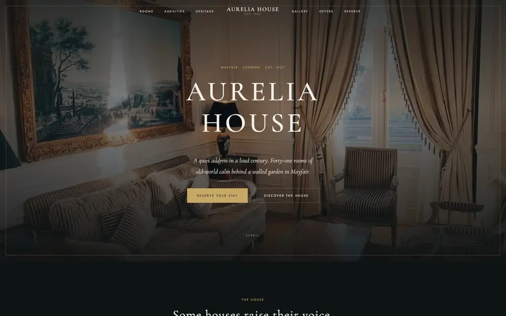
The real build, running in the page. The live preview is an embedded page. Press Escape to leave it.
Open it full screen