


01 · Overview
Care that feels like calm
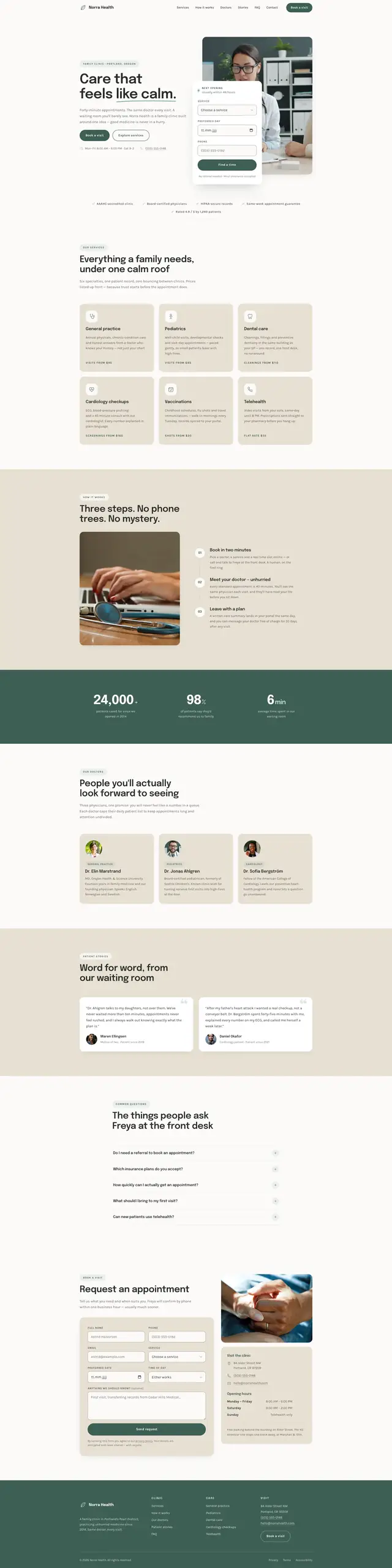
Most clinic websites are anxious. Red alert bars, phone numbers in three sizes, a portal login shouting from a corner. Norra's promise is the opposite — forty-minute appointments, the same doctor every visit, a waiting room you will barely see — and a page that contradicts that promise undoes it before anyone books.
So the whole build is an exercise in lowering the temperature: eucalyptus and pine instead of medical blue, twenty-pixel radii on everything, an eighty-millisecond step between siblings so content arrives rather than snaps, and a floor under every duration on the page.
02 · The idea
Three steps, no phone trees
The clinic's differentiator is procedural rather than clinical: booking takes three steps and you keep your doctor. The page had to make that legible in one screen, which meant the structure had to carry it — not a paragraph claiming it.
-
Pick your track
General practice, pediatrics, dental care, cardiology checkups, vaccinations, telehealth — six services, six plain cards, no jargon.
-
Meet your doctor
Three named physicians with their specialities, so the promise of continuity has faces attached to it.
-
Leave with a plan
The appointment request is the last thing on the page and asks seven questions rather than twenty. The booking box in the hero asks three.
03 · Goals
What the page had to do
-
Read at a glance and in depth
Six sections — services, how it works, team, stories, FAQ, appointment — each usable on its own if that is all somebody reads.
-
Answer the front-desk questions
Five questions in an accordion named after the receptionist I imagined fielding them, behaving like a conversation: one answer open at a time.
-
Carry the numbers the concept claims
The imagined practice has figures behind its promise — patients seen since it opened, the share who would recommend it, the average time in the waiting room — counted up once on entry and never on a loop. They are the concept's numbers, not a measurement of anything real.
-
Pass contrast without a plugin
A pale palette on a near-white ground is where accessibility quietly fails, so every borderline value carries its measured ratio in a comment beside it.
04 · Build order
How it was built
-
The palette, contrast-first
Twenty-two custom properties. Eucalyptus for surfaces, pine for anything that has to be read, sand for the calm blocks — and a dedicated field-border token proven against the 3:1 non-text requirement.
-
Twenty-six inline SVGs
Every icon, the brand mark and the hand-drawn scribble under the headline are markup. No icon font, no sprite sheet, no extra request.
-
The stagger
An eighty-millisecond step between siblings, written once as an inline transition delay on each member of a stagger group and cleared again after the entrance, so later hover transitions stay instant. The observer only adds a class; the browser does the timing.
-
The accordion
Height animated properly — pinned to the panel's measured height, transitioned, then settled back to auto on transitionend, so a long answer never clips at a narrow width.
-
Forms with a voice
Inline validation, a status region for the confirmation, and focus moved to it — so the outcome is announced, not just displayed.
05 · Architecture
Three files
Three files, served as written: 79.8 KB in total, with every graphic the clinic owns inside the HTML rather than beside it.
norra-health/
- index.html
- 39.5 KB
- 6 sections, 8 photographs, 26 inline SVG, 2 forms
- styles.css
- 30.8 KB
- 22 custom properties, 5 media queries, ratios in comments
- script.js
- 9.6 KB
- 285 lines: header, nav, reveals, counters, accordion, forms
The stack
- Semantic HTML
- CSS Grid
- Inline SVG
- Custom properties
- IntersectionObserver
- transitionend
- Epilogue
- Karla
Accessibility surface
- aria-expanded
- aria-controls
- role=status
- Focus moved on submit
- WCAG 1.4.11
- Escape to close
- Reduced motion
06 · What fought back
The things people ask
This section borrows the clinic's own structure. The problems are set as questions and answers, because that is how the page they came from answers anything.
-
Question
A pale palette on a near-white ground is where accessibility quietly fails — and a form field's edge is not text, so it is easy to forget that it still owes 3:1 as a control boundary.
Answer
The field border is its own opaque token rather than an ink tint the booking card's white fill could wash out. It measures 3.13:1 against the field fill on every surface it lands on, and the reasoning sits above the value in the stylesheet.
-
Question
Eucalyptus is the brand colour and it cannot be read. As a text colour it fails AA on every surface this page has.
Answer
It stays decorative — fills, tints and rules only. Pine carries anything that has to be read; a lighter eucalyptus tint carries small text on pine at 4.8:1; and the warm white set on pine sits at 4.9:1. The palette kept its range without shipping unreadable text.
-
Question
An accordion animated to a fixed height clips a long answer at a narrow width. Animated to auto, it does not animate at all.
Answer
The panel's height is pinned to its measured height, transitioned, then settled back to auto on transitionend — with the listener removed before each new run, so an open-then-close can never resolve to auto on a panel that is shut.
-
Question
A staggered entrance is easy to schedule in JavaScript and expensive to run there: one timer per element, competing with the scroll.
Answer
The eighty-millisecond step is written once as an inline transition delay on each sibling of a stagger group and removed once the entrance has finished. Under reduced motion the delays are cleared and everything is simply shown.
07 · Worth keeping
The parts worth keeping
-
The hand-drawn underline
An inline SVG scribble under the words 'like calm' — the one imperfect line on an otherwise very tidy page, and the reason it reads as human.
-
Three steps, no phone trees
The booking explainer laid out as three numbered cards with real copy, rather than icons with one-word labels under them.
-
Freya's FAQ
Five questions named after the receptionist I imagined fielding them, which changes the register of every answer beneath it.
-
Ratios in the source
Contrast measurements written beside the values they justify. The next person to touch this palette inherits the reasoning, not just the hex.
08 · Run it live
Run it here
The real build, embedded and running. It loads on demand, so nothing is fetched from the clinic until you ask for it.
Skip the live preview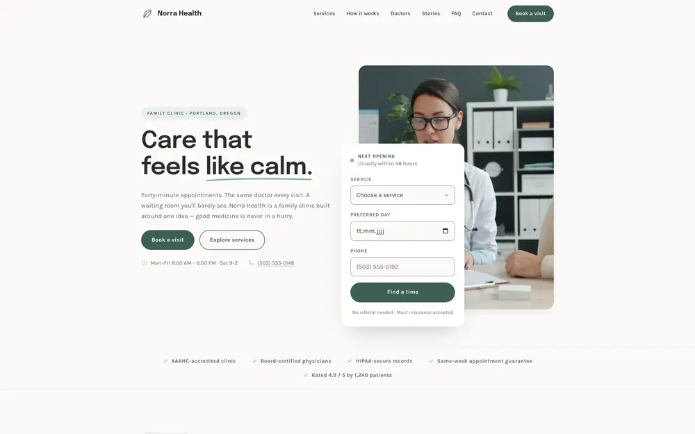
The real build, running in the page. The live preview is an embedded page. Press Escape to leave it.
Open it full screen