

01 · Overview
We sold the mirrors and bought more plates
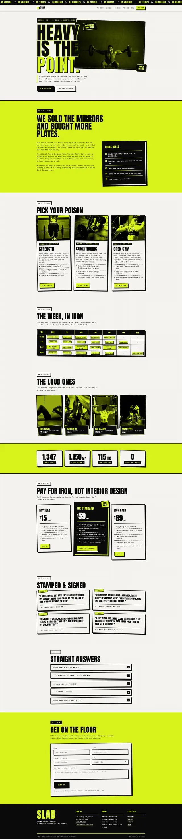
Every gym website looks like a spa. Soft gradients, a woman smiling at a dumbbell, a stock photo of a smoothie. For this concept I imagined SLAB as a concrete floor in Detroit with 41 racks and no mirrors, open 115 hours a week, and the site had to be recognisably the same building.
So the page is built like the equipment: three-pixel borders, eight-pixel hard shadows offset down and right, a 48-pixel floor grid ruled across everything, and one acid yellow used as a surface and never as text. Nothing is soft, nothing is rounded and nothing fades — reveals snap in ninety milliseconds of linear transform with no opacity change at all.
02 · The idea
The interface as equipment
One rule holds the build together: the interface is equipment. It stacks, it is bolted at the edges, it is labelled, and it never pretends to be lighter than it is. Three decisions follow from that, and nothing in the build breaks them.
-
Shadows are physical
A hard 8px 8px 0 offset with no blur at all. It reads as a plate resting on a plate rather than as UI elevation.
-
Acid is a surface
Yellow fills blocks and chips. It is never text, because #D8F21D on white is a contrast failure and no brand is worth that.
-
No easing curve
Ninety milliseconds, linear. Easing implies momentum, and momentum implies softness.
03 · Goals
What the page had to do
-
Filter, don't convert
The page is supposed to put some people off. The manifesto is second on the page, before the programmes and long before the price, for exactly that reason.
-
Publish the whole week
A full class schedule in a table you can actually read on a phone, because that is the question every prospective member has first.
-
Price without apology
Three tiers, no annual-discount theatre, headed 'pay for iron, not interior design'.
-
Sign people up in one screen
Name, email, phone, goal, plan. Five fields with inline errors at the foot of the page, no step before them, and the confirmation announced through a status region rather than only shown.
04 · Build order
The programme
Structure and rule first, then type at full volume, then the one piece of motion the page allows itself, then the hardest component last.
-
Grid and border
The 48-pixel floor grid and the three-pixel border went in before any content. Everything after them had to survive them.
-
Type at full volume
Anton for display, Roboto Mono for everything else. The body face is the monospace, which is what makes the page read as printed equipment labelling.
-
Stamp-in reveals
A 90ms linear scale with no fade, plus a post-load safety net that unhides anything the observer missed.
-
The week, in iron
The schedule table, built last because it is the hardest thing on the page to keep readable at 375 pixels.
05 · Architecture
Three files
No bundler, no framework, no icon font and no node_modules. Three files served as written, and eleven custom properties holding the entire look.
slab-strength/
- index.html
- 36.0 KB
- 8 sections, 8 duotone photographs, 0 inline SVG, 1 form
- styles.css
- 37.7 KB
- 11 root custom properties, 7 media queries, 2 reduced-motion blocks
- script.js
- 12.2 KB
- 368 lines: nav, stamp reveals, counters, form, anchors
The stack
- Semantic HTML
- CSS Grid
- Hard shadows
- IntersectionObserver
- requestAnimationFrame
- Anton
- Roboto Mono
- Vanilla JavaScript
Accessibility surface
- aria-expanded
- aria-controls
- Status region
- Real table markup
- Load safety net
- Focus moved on anchor
- preventScroll
- Reduced motion
06 · What fought back
Problems, and what beat them
-
Challenge
Acid yellow is the brand, and it fails contrast against both white and black at text sizes. Using it for headings would have been a straight WCAG failure on the loudest element of the page.
Solution
Acid was defined as a surface token from the start. It fills blocks that carry black text and never colours type. The brand is fully present and nothing on the page is unreadable.
-
Challenge
Reveal-on-scroll hides content by default. On a page whose whole personality is bluntness, content stuck invisible because an observer never fired would be the worst possible failure.
Solution
A safety net on window load sweeps every still-hidden element and unhides it. The reveal is an enhancement with an explicit deadline.
-
Challenge
A seven-day class schedule is a wide table, and wide tables at 375 pixels are where most gym sites simply give up and hide the content.
Solution
Real table markup that becomes a stack of day blocks below the breakpoint, each row keeping its header association. Most of the seven media queries in the build exist for this one component.
-
Challenge
An in-page link that only scrolls leaves the keyboard behind: the view moves, focus does not, and the next Tab carries on from wherever the reader already was.
Solution
Scrolling stays in CSS and the script only moves focus. Every anchor gives its destination a tabindex of -1 and focuses it with preventScroll once the scroll has settled — immediately under reduced motion, where there is nothing to settle.
07 · Worth keeping
The parts worth keeping
-
Heavy is the point
Three stacked stamps, the third outlined rather than filled. The whole brand in one hero, no photograph required.
-
Pick your poison
Programme cards with duotone photography rotated a degree and a half off true, so the grid never feels machine-set.
-
The loud ones
Coaches introduced with their lifts rather than their certifications.
-
Straight answers
An FAQ that answers 'do you have a sauna' with 'no'. The copy and the design are doing the same job.
08 · Run it live
Run it here
The real build, embedded and running. Nothing is fetched from it until you ask, so the page you are reading stays as light as it looks.
Skip the live preview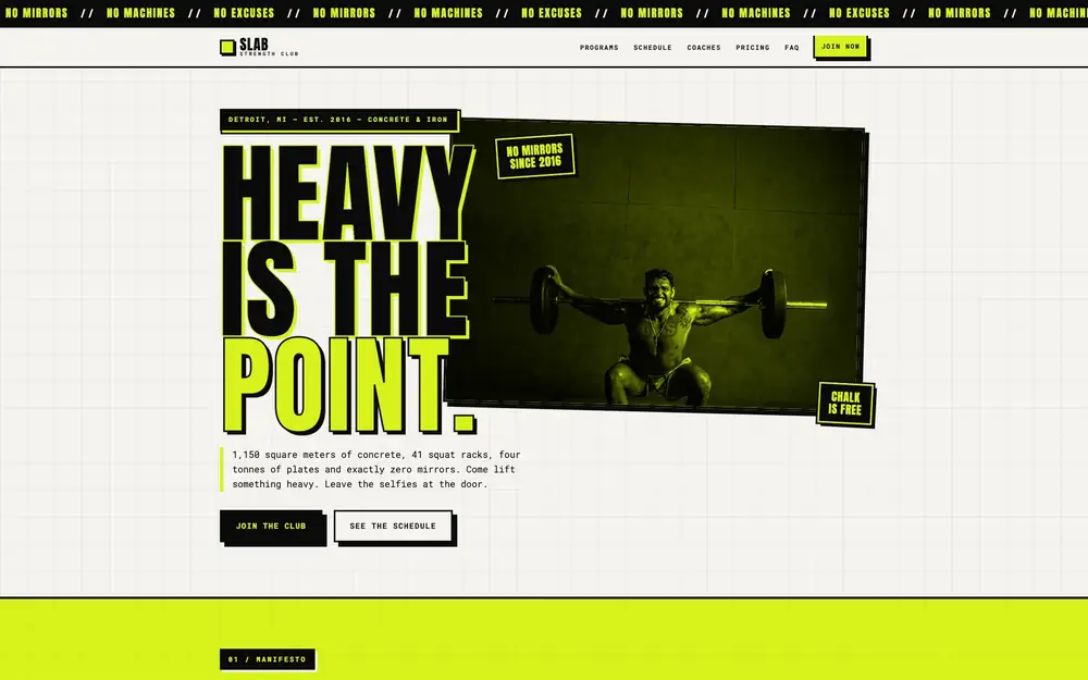
The real build, running in the page. The live preview is an embedded page. Press Escape to leave it.
Open it full screen