



01 · Overview
A darkroom, not a gallery
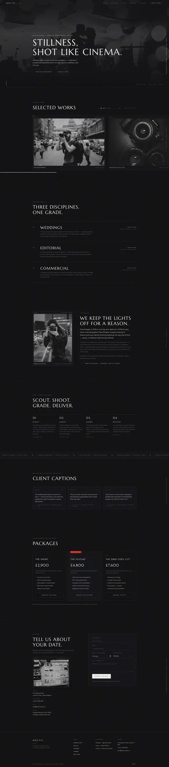
Photographers' websites usually make one of two mistakes: a lightbox grid that treats every image as interchangeable, or a full-bleed slideshow that lets you look at nothing for very long. For this concept I imagined Noctis as a studio that grades every frame by hand and takes eighteen weddings a year, so the site had to be as selective as the booking calendar.
It behaves like a darkroom instead. The ground is near-black, the only colour is a signal red used the way a camera uses it, reveals arrive as a shutter wipe rather than a fade, and the work sits on a strip you drag — a contact sheet, not a carousel.
02 · The idea
Available light, hand-graded
Three decisions carry the build, and each of them borrows the discipline of the equipment rather than a web convention.
-
Red is a signal
Record dots, frame counters, one call to action. Never a background, never decoration — exactly how the camera uses it.
-
Wipes, not fades
Every reveal is a clip-path travelling in one direction. It reads as a shutter, which is the one metaphor this brand has earned.
-
A cursor that behaves
A custom dot on fine pointers only, which never replaces the system cursor over text or a form field.
03 · Goals
What the page had to do
-
Show work at a size worth showing
A horizontal strip where each frame is big enough to judge, and where moving through it is a deliberate act rather than an autoplay.
-
Explain three disciplines without three pages
Weddings, editorial and commercial in one section under one grade, because the studio treats them the same way.
-
Publish real availability
A booking diary computed from the current date, opening on the first of the month, instead of a form that promises someone will be in touch.
-
Never trap the reader in the dark
If the script fails, the onerror handler strips the JS class so nothing stays hidden behind a wipe that will never run.
04 · Build order
Ten modules, in order
The script is written as ten numbered modules, and they went in in the order the page depends on them: the grade, then the frame around it, then the motion, then the two things that take an enquiry.
-
The grade
Fourteen custom properties on :root: near-black, a lifted black so panels read without a border, a silver and two hairline greys, and three reds — the brand red, a deeper shade for white type on a red fill at 4.95:1, and a brighter one for red type on the near-black ground at 4.64:1.
-
Header and overlay nav
A condensing header and a full-screen menu with a tab trap. These came first, because everything else on the page sits under them.
-
The wipe
One easing curve, one clip-path direction, applied through a single class so every section reveals identically.
-
The drag rail
Pointer capture, arrow buttons, a live counter and keyboard focus safety — the largest single module in the build.
-
The diary and the form
Availability derived from the actual date, then a five-field booking enquiry that quotes a reference back.
05 · Architecture
Three files
No bundler, no slider library and no dependency of any kind. The rail, the cursor, the wipes and the diary are 796 hand-written lines across ten modules in one file.
noctis-studio/
- index.html
- 31.2 KB
- 6 sections, 10 photographs, 0 inline SVG, 1 form
- styles.css
- 39.5 KB
- 14 root custom properties, 19 media queries, 2 reduced-motion blocks
- script.js
- 25.6 KB
- 796 lines in 10 numbered modules
The stack
- Pointer capture
- clip-path
- Custom cursor
- IntersectionObserver
- Date maths
- CSS Grid
- Marcellus
- Figtree
Accessibility surface
- Tab trap
- aria-live counter
- Offset anchors
- Keyboard rail
- onerror fallback
- pointer: fine gate
- Reduced motion
06 · What fought back
Problems, and what beat them
-
Challenge
Drag-to-scroll built with document-level mousemove listeners breaks the moment the cursor leaves the element, and leaks a listener every time the pointer is lost.
Solution
setPointerCapture. The element keeps receiving events wherever the cursor goes, and the browser releases the capture itself on pointerup or pointercancel, with no cleanup code to forget.
-
Challenge
A drag that finishes on top of a link fires a click, so releasing the mouse after moving the rail navigates away from the page.
Solution
Track the total travel and swallow the click in the capture phase if it exceeds a few pixels. Below the threshold it was a click; above it, it was a drag.
-
Challenge
A custom cursor is the fastest way to make a site feel broken: it lags on a trackpad, disappears over inputs and means nothing at all on touch.
Solution
It is gated behind a fine-pointer query, so it never exists on touch, and the real cursor is restored over every interactive element rather than hidden globally.
-
Challenge
Clip-path reveals hide content by default, and this is the darkest page in the set — a failed script would leave a black screen with no explanation.
Solution
The script tag carries an onerror that removes the JS class, so a failed load reverts every wipe to its settled state instead of hiding the studio's entire portfolio.
07 · Worth keeping
The parts worth keeping
-
Selected Works
A drag strip with arrows, a counter and keyboard paging. Every input method reaches every frame.
-
The booking diary
Availability derived from the actual date and opening on the first of the month — real scarcity rather than a claimed one.
-
The camera HUD
A frame readout in the hero that borrows the viewfinder's own typography. Pure CSS, no canvas and no image.
-
We keep the lights off
An atelier section that explains the grade — the one place the studio talks about method instead of showing results.
08 · Run it live
Run it here
The real build, embedded and running. Nothing is fetched from it until you ask, so the page you are reading stays as light as it looks.
Skip the live preview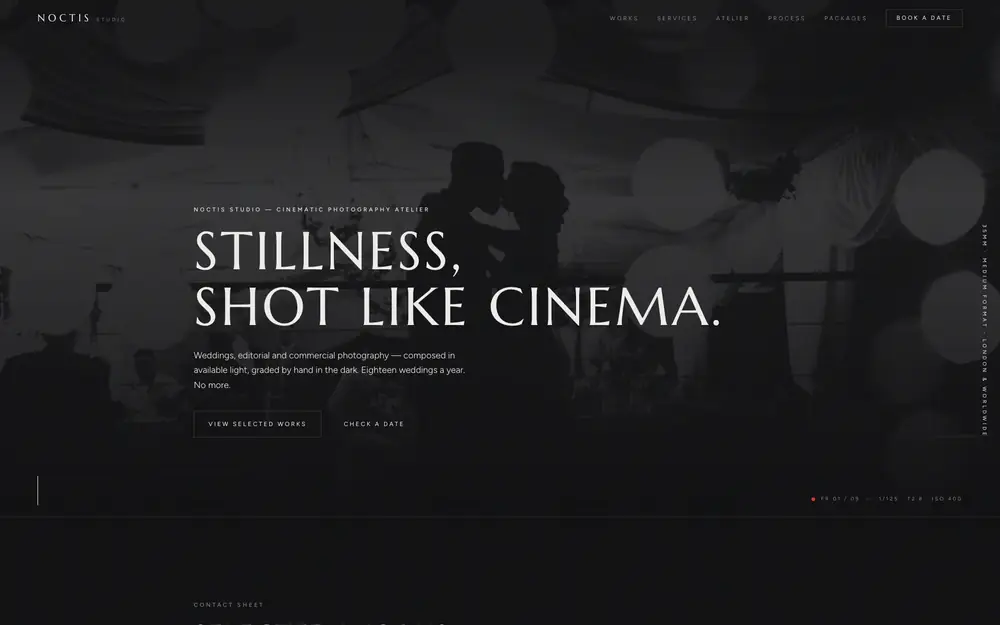
The real build, running in the page. The live preview is an embedded page. Press Escape to leave it.
Open it full screen