



01 · Overview
Momentum, not guesswork
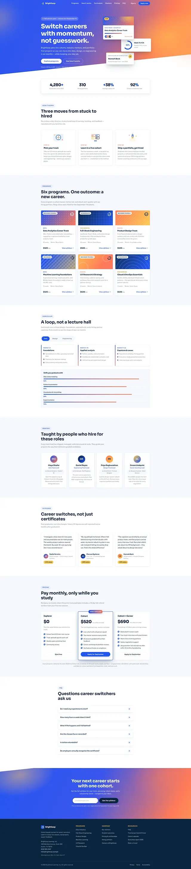
For this concept I imagined Brightloop as a career school whose actual product is structure: live cohorts, industry mentors, portfolio-first projects, six months, alongside a day job. Bootcamp marketing usually runs on two things, a salary figure and a stock photograph of somebody delighted by a laptop. Structure is the thing worth showing, and a photograph cannot show it.
So the page carries no photography at all. Thirteen inline SVGs hold the entire visual system, and the proof points are instruments: rings that fill, bars that grow, numbers that count. They all run off the same observer and one custom property written once per frame, so the page measures itself without spending the frame budget doing it.
02 · The idea
Instruments, not illustrations
On the live page every instrument fills from one custom property, written once per frame while its section is on screen. Three rings, three bars, one write.
The figures those instruments carry are concept content, invented for this build to test the pattern against numbers of a plausible shape. They are not statistics from a real cohort, and the cards below name each one as invented rather than dressing it up as an outcome.
-
The placement ring
An invented 91% placement rate, written for this concept rather than measured from anything, and chosen because a percentage is exactly what a progress ring is built to show.
-
The rating dial
An invented alumni rating of 4.9 out of 5, made up for this concept, and chosen because a fractional score exercises the count-up in a way a round number does not.
-
The partner count
An invented figure of 310 hiring partners, made up for this concept, and chosen because three digits are where a count-up either reads well on the way up or clearly does not.
03 · Goals
What the page had to do
-
Explain a loop, not a lecture hall
The curriculum is iterative, so it is presented as a tabbed loop rather than a linear week-by-week table that would misdescribe it.
-
Six programmes, one outcome
Data, design and engineering tracks that all resolve to the same promise, without six near-identical landing pages saying it six times.
-
Price in the open
Pay monthly, only while you study — stated as a headline above the pricing block rather than hidden behind an enquiry form.
-
Make the numbers behave
Every figure animates once, from one shared pipeline, and prints immediately at its final value under reduced motion.
04 · Build order
Twelve modules, one pipeline
Twelve numbered modules across 654 lines, and one of them does most of the work: everything that animates on entry registers with the same observer rather than bringing its own.
-
Tokens and the shadow scale
Twenty-two custom properties — navy, cobalt, coral, amber, a tint and a hairline, plus a three-tier shadow scale that does all of the elevation work on the page.
-
The animate-when-seen pipeline
The keystone: one observer feeds rings, bars and count-ups. Three effects, one registration point, one place to fix a bug when one appears.
-
The SVG instruments
The rings declare a pathLength of 100, so stroke-dasharray and stroke-dashoffset are literally percentages. There is no circumference arithmetic anywhere in the build, and the ring can be any size.
-
The curriculum tabs
Three panels, a roving tabindex, aria-selected kept true, and the panel content sitting in the markup rather than fetched when a tab is pressed.
-
Depth parallax
The hero cards drift at coefficients declared in data-depth attributes, so the composition is authored in the markup rather than hard-coded in the script.
05 · Architecture
Three files, no dependencies
No bundler, no framework and nothing installed: three files served exactly as written, 51.2 KB of markup, 42.1 KB of CSS and 20.3 KB of JavaScript. The browser is the only runtime this build has ever needed.
brightloop/
- index.html
- 51.2 KB
- 8 sections, 13 inline SVG, 0 images, 1 form
- styles.css
- 42.1 KB
- 22 custom properties, 4 media queries, 1 reduced-motion block
- script.js
- 20.3 KB
- 654 lines in 12 numbered modules
The stack
- Inline SVG
- pathLength
- IntersectionObserver
- data-depth
- CSS Grid
- Custom properties
- Sora
- Public Sans
- Vanilla JavaScript
Accessibility surface
- Roving tabindex
- aria-selected
- SVG role and label
- aria-live
- Announced once, not per frame
- Reduced motion
06 · What fought back
Problems, and what beat them
-
Challenge
SVG progress rings normally need the circumference computed from the radius, which puts a magic number in the CSS that breaks the moment the geometry changes.
Solution
A declared pathLength of 100 redefines the path as 100 units long, so stroke-dasharray and stroke-dashoffset are percentages. The ring can be any size and the maths never changes.
-
Challenge
Rings, bars and count-ups are three effects that all mean the same thing: start when visible. Three observers would be three places for the same bug to hide.
Solution
One observer, one registration attribute, three renderers. A fourth instrument later is a renderer rather than another observer, and the reduced-motion path is written once for all of them.
-
Challenge
A decorative SVG chart is invisible to a screen reader, and an animating number inside one is worse than invisible.
Solution
Every instrument carries an img role and an aria-label stating its final value in words, and the animated figure beside it is kept out of any live region. The value is announced once, correctly, whatever the motion setting.
-
Challenge
Hero parallax with per-element coefficients written into JavaScript means editing the script to move a card. The design ends up living in the wrong file.
Solution
Each card declares its own data-depth. The script reads the attribute, and the composition stays in the markup where whoever is designing it can change it.
07 · Worth keeping
The parts worth keeping
-
Three moves from stuck to hired
The whole proposition in one row, placed before any pricing or programme detail, so the shape of the thing arrives before the shopping does.
-
A loop, not a lecture hall
The curriculum tabs, which make an iterative structure legible without needing a diagram to explain the diagram.
-
Taught by people who hire
Mentors introduced by the roles they recruit for rather than by a job title, which is the most persuasive block on the page and costs nothing to build.
-
Only while you study
Monthly pricing that stops when the course does, said plainly in the heading above the prices rather than in a footnote under them.
08 · Run it live
Run it here
The real build, embedded and running. It loads on demand — nothing is fetched from it until you ask for it.
Skip the live preview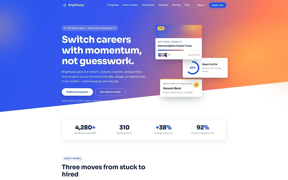
The real build, running in the page. The live preview is an embedded page. Press Escape to leave it.
Open it full screen