



01 · Overview
A shop that behaves like a field journal
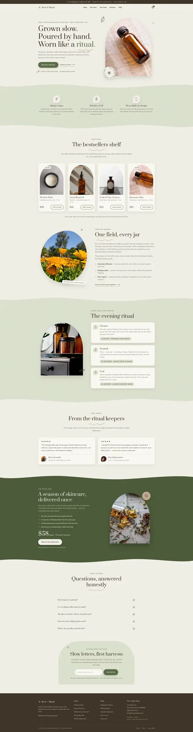
Skincare e-commerce has one default: a white grid of jars with a discount badge. For this concept I imagined a brand that grows its own calendula, nettle and rugosa rose on two acres and pours thirty-four jars per batch. A white grid would flatten the only thing that makes it worth buying.
So the page is warm paper with a fractal-noise grain fixed over the whole surface, the plates are arch-topped the way the product photography is, and the reveals settle out of a two-degree rotation. Nothing arrives perfectly square, because nothing here is machine-made.
02 · The idea
Scarcity you can count
The fictional brief called for every batch to be numbered and every jar to be one of thirty-four — a constraint to design around rather than a marketing device. So the page treats the number as content: it appears in the masthead, on the product shelf, and in the last line of the footer.
-
The arch
A single shape, border-radius: 50% 50% 0 0, used on plates, product cards and the hero. It is the page's entire ornament vocabulary.
-
Grain over everything
An feTurbulence filter fixed above the background. Inline, so it costs one declaration and not a single request.
-
Nothing lands square
Reveals settle from minus two degrees, and cards tilt very slightly under a fine pointer. Both disappear entirely under reduced motion.
03 · Goals
What the page had to do
-
Sell four products properly
A bestsellers shelf with real ingredients, batch numbers and prices, rather than a grid of thumbnails and a filter bar.
-
Tell the field's story once
One field, every jar — the provenance section that justifies the price, placed before the shop rather than after it.
-
Teach the ritual
An evening sequence in four steps, because the product only works if somebody uses it in order.
-
Take an email without begging
Slow letters, first harvests: a subscription block that names what arrives instead of promising a discount.
04 · Build order
How it was built
The build followed the order the page reads in: the palette first, then the drawings, then the paper they all sit on, then the two pieces of behaviour that make it a shop.
-
The palette from the field
Eighteen custom properties on :root, sampled from the plants themselves — oat, espresso, moss, sage, tan and cream, plus a deepened moss for anything that has to be read.
-
Forty-six inline SVGs
Squiggles, leaves, the wavy underline, every icon and the seal. Nothing rasterised, nothing from an icon set.
-
The grain layer
Fixed, pointer-events none, above the background and below the content, at an opacity low enough to feel like paper rather than noise.
-
The arch system
One radius token applied at three scales — hero, plate, product card — so the shape reads as a system rather than a flourish.
-
Basket and accordion
Add-to-basket with a re-entry guard so a double click cannot add twice, and an FAQ that keeps one answer open at a time.
05 · Architecture
Three files
There is no bundler and no icon set. The grain, the seal, the leaves and every icon are drawn in the markup itself; the only binary assets the page asks for are the photographs and two self-hosted fonts.
root-and-ritual/
- index.html
- 42.1 KB
- 6 sections, 10 photographs, 46 inline SVG, 1 form
- styles.css
- 31.7 KB
- 18 root custom properties, 5 media queries, 1 reduced-motion block
- script.js
- 9.3 KB
- 300 lines: header, nav, reveals, tilt, basket, accordion
The stack
- feTurbulence
- CSS Grid
- Inline SVG
- CSS-only tilt
- IntersectionObserver
- Prata
- Nunito Sans
- Vanilla JavaScript
Accessibility surface
- Live region basket
- aria-expanded
- Focus moved on anchor
- hover: hover gate
- pointer: fine gate
- Reduced motion
06 · What fought back
Problems, and what beat them
-
Challenge
A full-page grain overlay is a fixed element covering the viewport, which is the classic way to make every link on a site unclickable.
Solution
pointer-events none on the layer, and it sits below the content rather than above it. The grain is visible over the background and never over a control.
-
Challenge
Mouse-tracked 3D tilt on product cards means one listener and one transform per card. With a shelf of them, that is a great deal of work per frame for a decorative effect.
Solution
The tilt is a CSS hover transform gated behind hover, fine pointer and a no-preference reduced-motion query. No listener, no frame cost, and on touch it does not exist at all.
-
Challenge
Moss green on oat looks right and measures wrong. The mid-tone I picked for the brand fell to 4.30:1 on the sage panels, which is under AA on the eyebrow labels that sit there.
Solution
Two greens. The lighter moss fills shapes and rules; a deepened moss carries every piece of accent text at 4.64:1, and white on moss gained contrast rather than losing it, 5.79:1 to 6.25:1. The palette is unchanged to look at and passes.
-
Challenge
Add-to-basket fired on every click, so a double click quietly added two jars from a batch of thirty-four.
Solution
A re-entry guard on the button that ignores repeat presses until the confirmation has been announced in the live region. The feedback and the lock share one piece of state.
07 · Worth keeping
The parts worth keeping
-
The bestsellers shelf
Four arch-topped cards with ingredients, batch numbers and prices. A shelf, not a grid.
-
One field, every jar
The provenance section, placed before the shop so the price makes sense by the time you reach it.
-
The evening ritual
Four steps with hand-drawn marks, which is the closest a web page gets to the instruction card in the box.
-
Batch No. 34 is pouring now
A footer line that changes with the batch — the fictional inventory carried through to the very last word on the page.
08 · Run it live
Run it here
The real build, embedded and running. Nothing is fetched from it until you ask, so the page you are reading stays as light as it looks.
Skip the live preview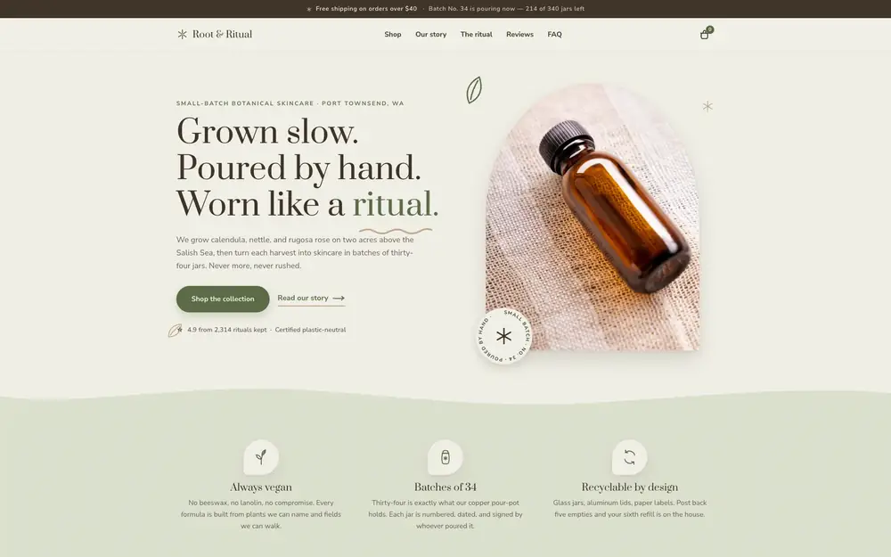
The real build, running in the page. The live preview is an embedded page. Press Escape to leave it.
Open it full screen